What Paint Color To Choose For Your Front Door (15 Ideas)

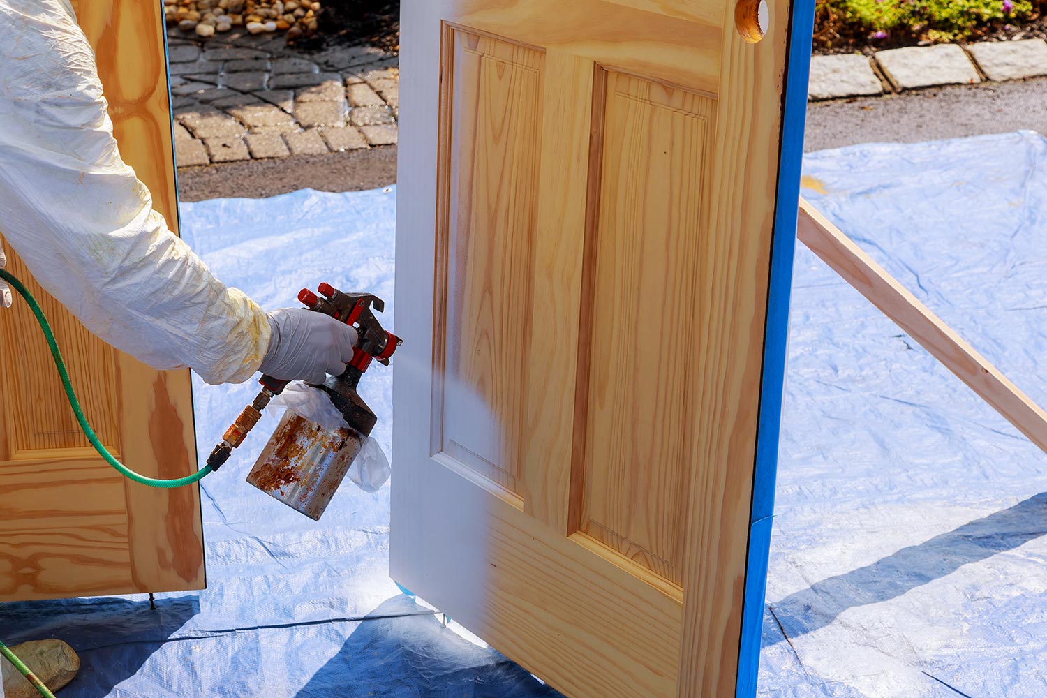
Along with your front door wreath, a fresh coat of paint on your door is one of the first things guests notice when they arrive at your home.
The right shade makes a plain door look striking and give a modern exterior some character.
From rich navy and classic black to cheerful yellow, earthy green, and unexpected pink, there are plenty of directions to explore.
The key is choosing a color that suits the house and still feels like you.
Here are some front door paint color ideas to inspire your next update.
READ ALSO: How To Decorate A Front Porch
15 Inviting Front Door Paint Color Ideas
Luckily, there are great paint brands to choose from and at more reasonable prices too.
Sherwin-Williams and Benjamin Moore are well-known premium paint brands, offering a wide selection of products for both interior and exterior projects.
1. Glossy Black Door in a High Gloss Finish

A glossy black front door has a certain presence that is hard to miss. The high shine catches daylight across the surface and gives the entrance a dramatic finish.
This shade suits homes with white, cream, gray, or pale stone exteriors.
Brass hardware can add warmth, while silver or chrome handles keep the entrance looking sharper and more contemporary.
The finish matters just as much as the color. High gloss reflects light and shows the details of the door clearly, so the surface needs regular cleaning to keep fingerprints.
Keep the surrounding area simple if the door has strong visual impact. A pair of planters or a clean porch light may be all the entrance needs.
Pro Tip: High gloss paint highlights dents and surface imperfections. Sand and smooth the door properly before painting for a cleaner result.
2. Traditional Red Door
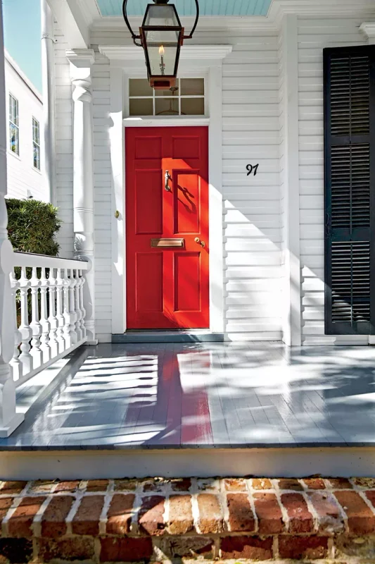
There is a reason red has remained a favorite for front doors for generations. It gives the entrance warmth and character, from deep burgundy shades on older homes to brighter reds on cottage style exteriors.
A traditional red door pairs nicely with white trim and brickwork. Black hardware keeps the appearance classic, while aged brass adds a warmer, more traditional touch.
The shade you choose can change the entire impression. Deep reds suit homes with darker brick or stone, while a brighter red brings a cheerful note to a pale exterior.
Red does not need much help from the rest of the entrance. A simple wreath, classic lantern, or two green plants can finish the porch neatly.
Pro Tip: Check the red paint outdoors at different times of day before committing. Natural light can change how warm or cool the color appears.
3. Deep Green against Light Siding
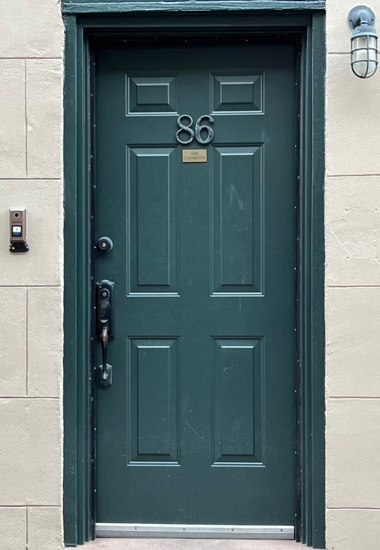
Deep green looks striking against light siding, particularly when the exterior has white, cream, or pale gray tones.
The darker door gives the entrance a clear focal point and adds color to an otherwise neutral facade.
Forest green and rich olive are two shades worth considering. Forest green has a cooler, traditional character, while olive brings a softer earthy quality to the entrance.
Natural surroundings can help guide your choice. Homes surrounded by trees, shrubs, or gardens can carry deeper greens naturally when the landscaping already contains plenty of foliage.
Wooden accents are another good match. A timber porch, natural wood bench, or brown doormat can add warmth around the green door.
Pro Tip: Look at the green next to your actual siding before buying the paint. Undertones become easier to spot when the two colors sit beside each other.
4. Solid Wood Door
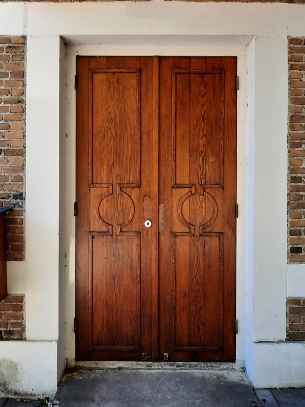
Sometimes the natural beauty of the material deserves to stay visible. A solid wood front door brings warmth through its grain, knots, and natural variations, giving the entrance a character that paint cannot quite reproduce.
Oak, walnut, mahogany, and other woods each have their own color and grain pattern.
A clear protective finish can preserve those details while helping the door handle changing weather conditions.
The hardware can shape the final appearance too. Black handles give the door a stronger contrast, while brass hardware pairs nicely with warm timber tones.
Keep the surrounding colors restrained so the wood remains the star of the entrance. White trim, stone steps, and simple greenery provide a clean setting for the natural material.
Pro Tip: Choose an exterior rated wood finish and follow the manufacturer’s preparation instructions. A quality finish needs periodic maintenance to protect the timber.
5. Bold Red for a Cute Look

A bright red door can give a small entrance a cheerful personality. Against a white, cream, or pastel exterior, the color adds a playful touch that suits cottages and smaller homes.
Candy apple red, cherry red, and coral red each bring something different. A warm red can pair nicely with colorful flowers, painted trim, or a cheerful porch mat.
Small details can push the look further. A seasonal wreath, colorful planter, or unusual door knocker can add charm around the bright paint.
The surrounding facade does not need to compete with such a strong color. Keeping the siding and trim simple lets the red door do the talking.
Pro Tip: If the entrance is small, paint the door and frame in the same red for a more unified appearance. Use lighter accessories to keep the area cheerful.
6. Pastel Blue for an Inviting Feel
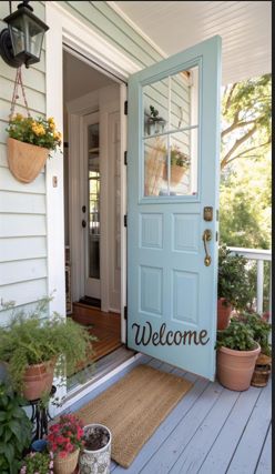
Pastel blue gives a front door a gentle splash of color that suits homes with a relaxed exterior. The shade looks lovely against white siding, pale gray walls, brick, or cream render.
A dusty or muted blue can give the entrance a softer appearance than stronger navy shades.
White trim keeps the color fresh, and natural wood details can add warmth around the doorway.
This shade also gives you plenty of freedom with porch decorations. Terracotta pots, white planters, woven mats, and green plants all sit comfortably beside a pastel blue door.
For a cottage inspired home, add a simple wreath or small wall lantern beside the entrance. The result has charm, but still looks like a practical everyday doorway.
Pro Tip: Test pastel blue on the actual door before painting the whole surface. Pale colors can look considerably different in direct sunlight and shade.
7. A Peach Door
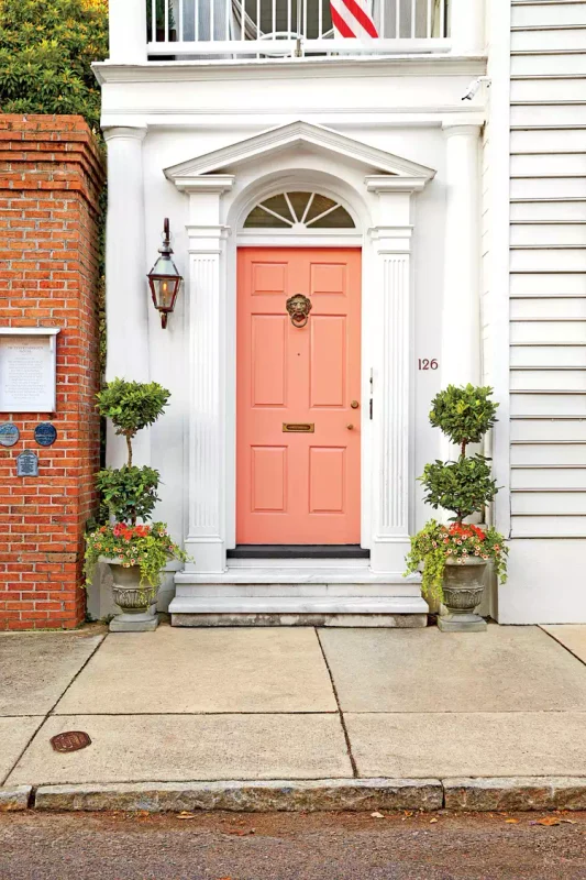
Peach is an unexpected choice for a front door, and that is precisely what gives it charm. The warm shade can soften a plain exterior and add a cheerful note to the entrance.
Paler peach works nicely with cream, white, and light beige exteriors. A stronger terracotta peach suits brick, warm stone, and homes with earthy landscaping.
Hardware can take the color in different directions. Brass gives peach a warm traditional touch, while matte black introduces a sharper contrast.
There is no need to fill the porch with matching decorations. A few green plants, a natural fiber doormat, and simple lighting are enough to support the warm color.
Pro Tip: Compare your peach paint with the exterior siding in daylight. Some peach shades lean pink, while others have stronger orange or beige undertones.
8. Graphite Gray for Sleek Sophistication
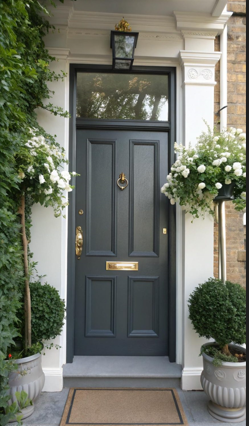
Graphite gray gives a front door a clean, contemporary appearance. It has the strength of a dark shade but feels less severe than pure black.
This color looks sharp against white or pale gray siding. It also suits modern homes with concrete, stone, metal, or dark window frames.
The hardware can stay simple here. Brushed steel and chrome reinforce the contemporary direction, while brass adds a warmer contrast against the cool gray.
A graphite door also provides a strong backdrop for greenery. Tall planters, clipped shrubs, or a few leafy plants can soften the darker entrance area.
Pro Tip: Choose an exterior paint with a finish suited to your door material. Graphite shows dust and surface marks, so a washable finish can make maintenance easier.
9. Earthy Green for Natural Aesthetics

Earthy green has a natural connection with the outdoors, which makes it a lovely choice for a home surrounded by plants.
Shades such as sage, moss, and olive can give the entrance a calm, organic character.
The beauty of this color lies in its range. A muted sage suits a pale cottage exterior, while a deeper moss green has enough weight to complement stone, timber, and red brick.
Wooden details pair naturally with green. A timber bench, wooden planter, or natural fiber mat can reinforce the outdoor character of the entrance.
Consider the landscaping before choosing your shade. If the garden contains lots of deep green foliage, a lighter door color may provide a clearer contrast.
Pro Tip: Take a few paint samples outside and compare them beside your plants. Green paint can change noticeably depending on the surrounding foliage.
10. Vibrant Orange for a Modern Touch
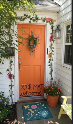
A vibrant orange front door is for anyone who wants the entrance to have some energy. The color looks striking against simple pale beige exteriors.
Burnt orange gives the idea a more muted direction, whereas bright tangerine has a much stronger modern character.
The right choice depends on how much attention you want the doorway to command.
Keep the rest of the entrance fairly restrained when using a saturated orange. Black hardware, simple lighting, and plain planters let the paint remain the main attraction.
This shade can look fantastic on a contemporary home with clean lines and minimal landscaping. Against darker siding, the contrast becomes even stronger.
Pro Tip: Try your orange sample next to the exterior at different times of day. Strong sunlight can make vibrant shades appear considerably brighter.
11. Rich Navy for Nautical Charm

Rich navy has that unmistakable coastal character, especially when it sits against a white or pale exterior.
It reminds me of classic seaside homes where the front door is simple, but the color gives it plenty of charm.
White trim makes navy look crisp, and natural wood adds a little warmth. A rope style doormat, a few green plants, or simple brass hardware can push the nautical idea further.
I’d choose navy if you want something traditional that still has some personality. It is dark enough to frame the entrance nicely, but it does not have the heaviness that some black doors bring.
Pro Tip: Navy looks great with white, but try it beside your actual exterior first. Some shades lean purple or gray once they are outside.
12. Black Matte Paint for a Timeless Elegance
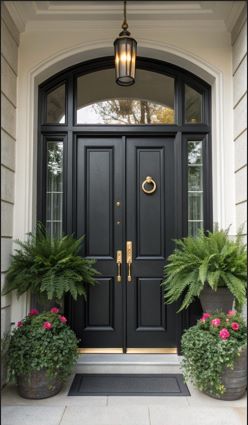
A matte black door has a quiet confidence that I really like. There is no shine competing for attention, so the shape of the door and its hardware get to do the talking.
It looks fantastic against light brick, white siding, cream walls, and natural stone. Brass handles can give it warmth, while black hardware keeps everything understated.
What I adore most about matte black is how easily it fits different homes. It can look traditional on a paneled wooden door, then take on a completely different character on a simple modern entrance.
A small plant beside the door is enough to soften the dark finish. You really do not need much decoration when the color already has this much presence.
Pro Tip: Matte finishes can show scuffs and fingerprints, so choose a good quality exterior paint that is suitable for regular cleaning.
13. The Classic Red Door
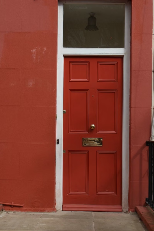
A red front door has a charm that never really seems to disappear. There is something cheerful about coming home to a door in a rich red shade, particularly against a white or cream exterior.
Deep burgundy gives the entrance a traditional appearance, while a brighter cherry red feels younger and livelier.
Brick homes are another great match because the warm colors naturally sit together.
I’d keep the decorations simple here. A green wreath, black lantern, or pair of planters is enough to make the red door feel like part of the home.
For me, this is one of those colors that makes a house look cared for. It has personality, but it does not require a complicated decorating scheme around it.
Pro Tip: Look at red samples outside before deciding. Sunlight can make a bright red appear much stronger than it looked under indoor lighting.
14. Brilliant Turquoise Blue Door
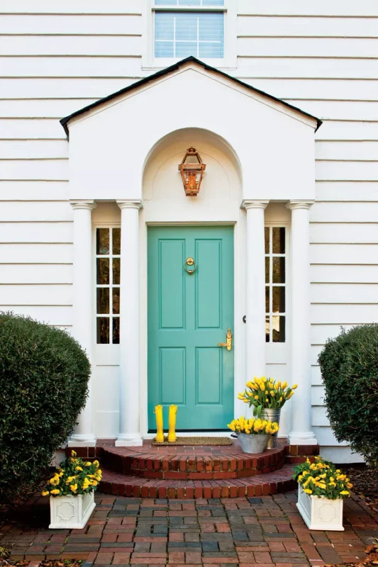
Turquoise is such a happy color for a front door. It has that sunny, holiday house quality that instantly makes an ordinary entrance feel less serious.
A brilliant turquoise looks fantastic with white walls and pale siding. Against natural wood, the blue becomes warmer, while black hardware gives the entrance a sharper contemporary edge.
I particularly choose this shade on cottages and homes with relaxed landscaping. Add a terracotta pot, leafy plant, or colorful doormat and the whole entrance starts to look wonderfully cheerful.
There is no need to match every accessory to the door. Let the turquoise be the one playful color that catches the eye when someone walks up to the house.
Pro Tip: Turquoise can look much brighter in direct sunlight. A small test patch will help you decide if the shade has the right amount of intensity.
15. Denim Blue Door
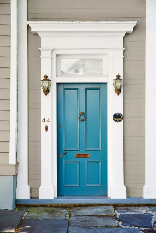
Denim blue sits in that lovely middle ground between bright blue and deep navy. It has enough color to make the entrance interesting, but it still feels easy to live with.
White trim is an obvious match, though I also like denim blue with warm gray, cream, and natural stone. The combination has a relaxed quality that suits older houses and newer homes alike.
This is a great choice if navy seems too dark and brighter blues seem too bold. Denim has a slightly faded quality that makes it easy to pair with wooden furniture, greenery, and simple porch decorations.
A woven doormat and a couple of leafy plants would be plenty around this kind of door. The color already gives the entrance something worth noticing.
Pro Tip: Compare denim blue samples against your siding in natural light. Gray undertones can become much easier to see outdoors.
FAQs
Should You Paint All Exterior Doors the Same Color?
Not necessarily. Keeping them the same gives the exterior a uniform appearance, but different colors can help distinguish the front, back, and side entrances.
How Much Paint Do I Need for My Front Door?
For most standard front doors, one quart of exterior paint is enough for two coats. Larger or heavily textured doors may require a little extra.
How Often Do I Need to Paint My Front Door?
Most front doors need repainting every 3 to 5 years, depending on the paint quality, weather exposure, and condition of the surface. Doors exposed to strong sun or heavy rain may need attention sooner.