17 Creative Living Room Paint Color Ideas That Brighten Your Space in 2026
Choosing a paint color for your living room can completely transform the space, but it can also feel overwhelming.
I’ve spent hours testing swatches on walls, watching how light changes the color throughout the day.
When you take the time to explore different shades, you discover how subtle differences can shape the room’s mood.
The right color helps your living room reflect your style. Here are a must-try living room pain color ideas.
Best Paint Color Ideas For Your Living Room
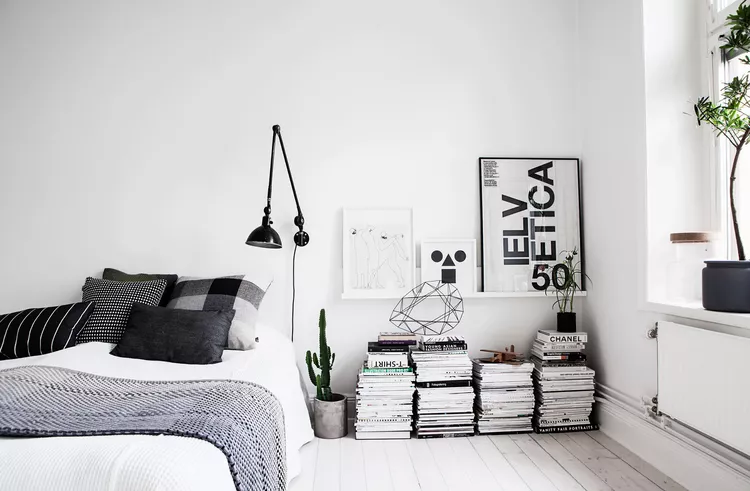
Soft Gray Walls That Keep Your Living Room Balanced
Soft gray gives you a dependable foundation that works with almost any style you bring into your living room.
It sits quietly in the background while allowing furniture and decor to take center stage.
If you want a crisp look, pair gray walls with clean white trim and light upholstery. The contrast sharpens the space and keeps it looking fresh.
To prevent the room from feeling flat, layer in texture through velvet pillows, chunky knit throws, or a woven rug. These details add warmth without changing the color palette.
You can also introduce accents like navy or mustard through chairs or cushions. Those touches break up the neutrality in a natural way.
I have used soft gray in homes where the decor changes often, and it always adapts easily. It gives you freedom to refresh your space without repainting every year.
Soft Neutrals That Catch the Light
Soft neutrals bring a natural brightness to a living room by reflecting daylight in a consistent way.
Shades such as warm ivory, pale greige, and light sand respond to changing light from morning through evening, creating variation across the walls as the sun moves.
These tones work across many interior styles, from modern spaces with clean lines to traditional rooms with layered decor.
Because they sit between warm and cool undertones, they coordinate easily with different furniture finishes and color accents over time.
To highlight their light-catching quality, combine them with sheer window treatments and reflective surfaces like glass tables or brushed metal lighting. These additions increase brightness across the room.
Texture plays an important role when decorating with soft neutrals, as woven rugs, linen sofas, and lightly patterned cushions prevent the space from appearing flat.
The combination of light and texture gives dimension to the walls to keeps the overall design interesting.
I suggest soft neutrals for homeowners who want a timeless backdrop that supports changing decor choices.
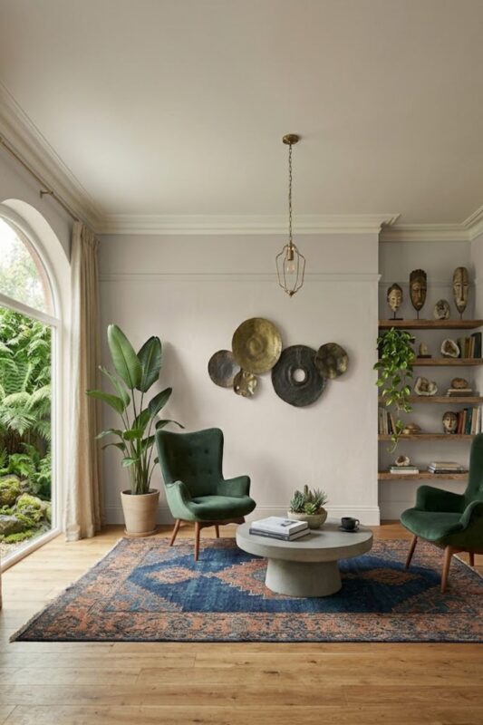
Classic White Walls That Brighten Your Space
Classic white paint has a way of instantly opening up a living room. It reflects natural light and makes even small spaces feel more spacious.
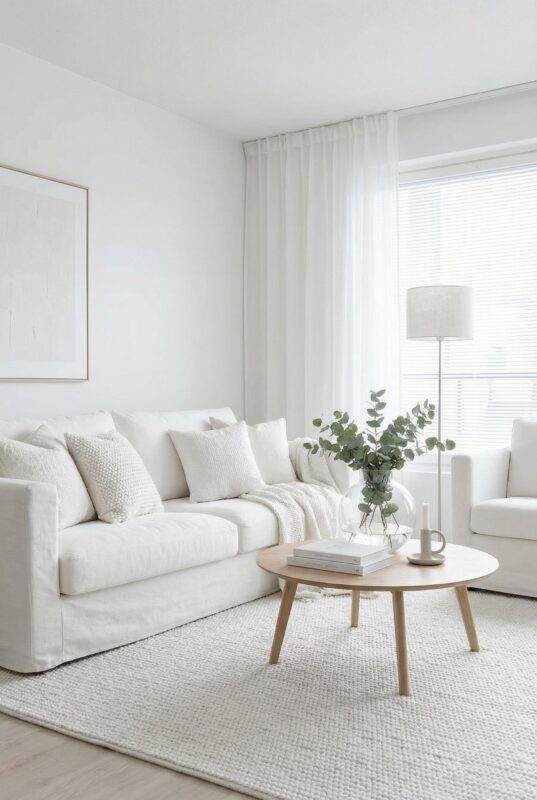
This shade works well in modern interiors with clean lines, yet it also supports traditional rooms filled with detailed furniture.
Think of it as a blank canvas that highlights art, statement sofas, or bold accessories.
Choosing a warm white rather than a stark one makes a noticeable difference. It keeps the room from feeling cold or overly clinical.
Balance white walls with wood furniture, woven baskets, or linen curtains to introduce depth. These materials prevent the space from looking unfinished.
I often recommend white to homeowners who like switching up their decor seasonally. It allows you to experiment with color elsewhere while keeping the backdrop simple and adaptable.
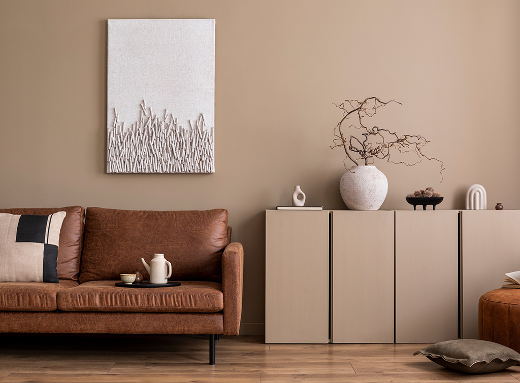
Warm Beige Walls for Everyday Comfort
Warm beige brings softness into a living room without overpowering it. It feels welcoming from the moment you walk in.
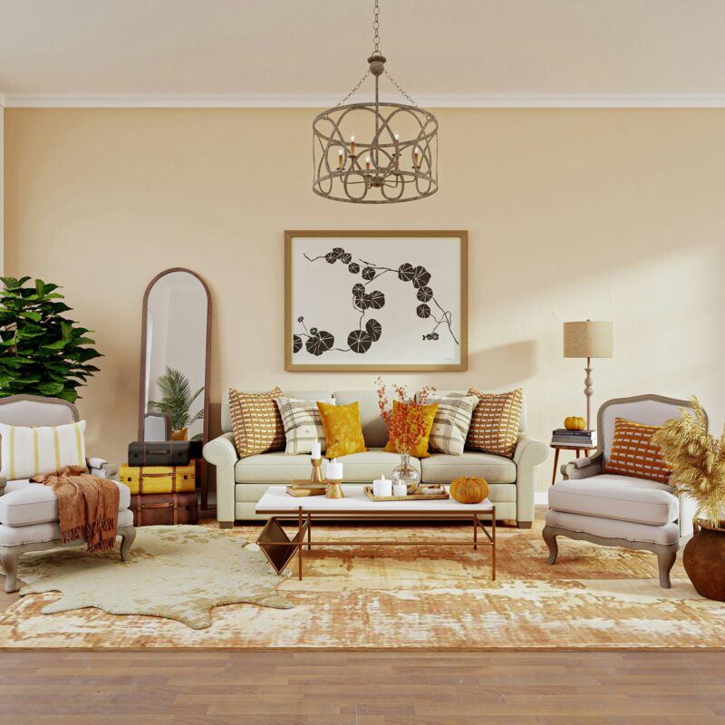
Unlike cooler neutrals, beige carries a subtle warmth that works especially well in rooms filled with natural light. As sunlight shifts throughout the day, the color develops a gentle glow.
This shade pairs beautifully with earthy tones such as terracotta, olive, and rust. Together they create a layered palette that feels cohesive and intentional.
Add textured fabrics like linen or wool to build dimension against the walls. Wood finishes also complement beige effortlessly.
I have noticed that beige often surprises people who expect it to look dull. When styled thoughtfully, it creates a calm backdrop that still holds character.
If you want a neutral that feels slightly richer than white, beige offers that balance.
Deep Navy Walls That Bring Drama
Navy blue walls introduce depth that immediately changes the atmosphere of a living room. The color draws you in and gives the space a sense of presence.
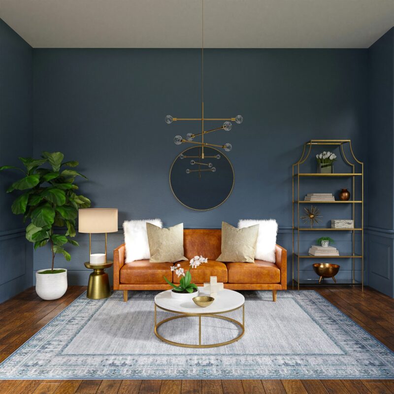
This shade works particularly well in larger rooms where it can create a more intimate environment. Instead of feeling cavernous, the space starts to feel enclosed in a comforting way.
Pair navy with light furniture in white or soft cream to maintain balance. The contrast prevents the room from appearing too dark.
Metallic accents such as brass lamps or gold framed art add brightness against the deep backdrop. These small details catch the eye without overwhelming the color.
I have seen navy transform plain rooms into striking gathering spaces. It works especially well if you entertain often and want a setting that leaves an impression.
When used confidently, navy becomes the defining feature of the room.
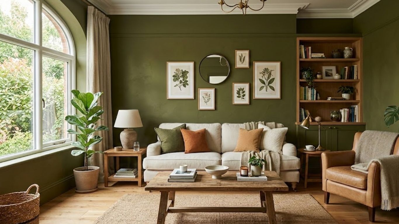
Sage Green Walls To Create a Natural Setting
Sage green offers a gentle way to introduce color into your living room. It carries a muted quality that keeps the atmosphere relaxed.
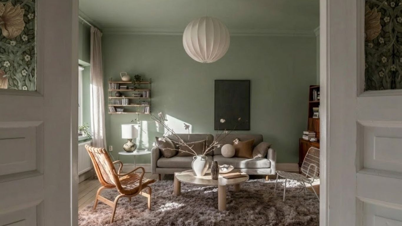
This shade pairs naturally with wood furniture, neutral sofas, and woven textiles. The combination creates a space that feels connected to nature.
If you enjoy contemporary decor, sage supports clean lines and simple layouts. In rustic homes, it enhances exposed beams and vintage pieces.
For contrast, consider adding blush cushions or copper accents. These tones warm up the palette without overpowering it.
I have recommended sage to clients who wanted color but felt hesitant about going bold. It provides personality while remaining easy to live with.
When you choose sage, you create a backdrop that feels steady and composed, making your living room a place where you can truly unwind.
Charcoal Gray Walls That Add Depth
Charcoal gray brings instant depth to a living room, especially if you want something adaptable. It creates a strong backdrop that allows lighter furniture to stand out clearly.
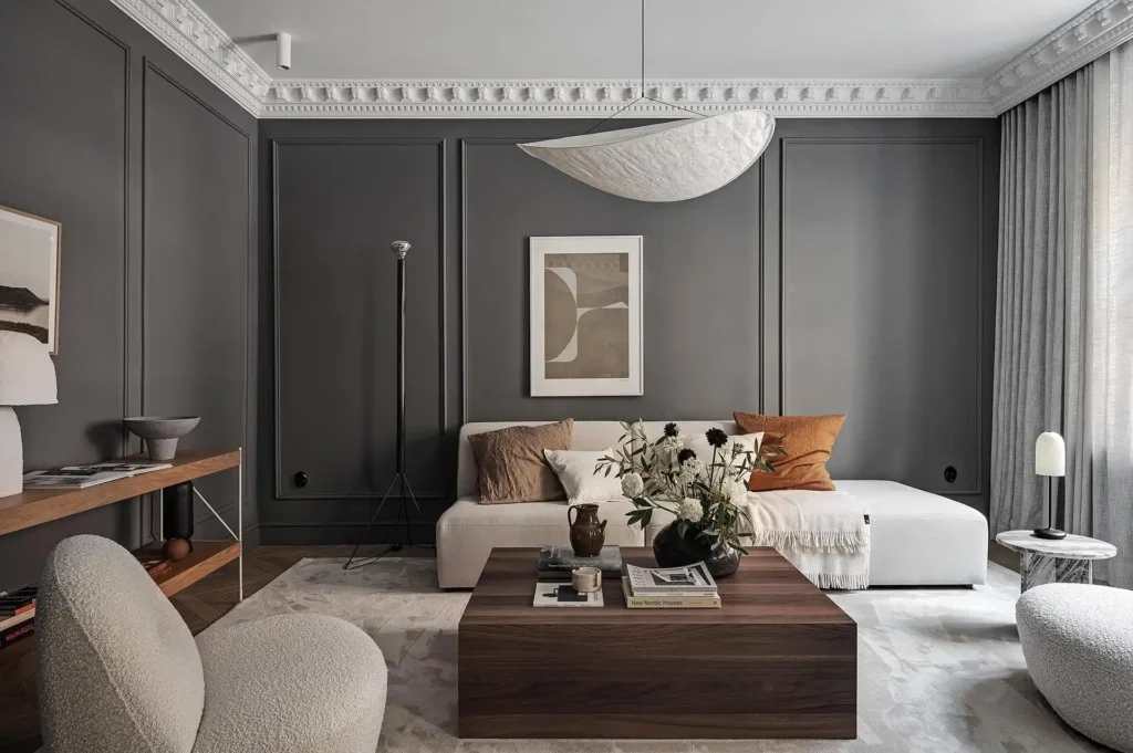
When you pair charcoal with cream sofas or pale wood tables, the contrast keeps the space from feeling heavy.
Metallic accents such as brushed brass or chrome also reflect light and prevent the walls from absorbing too much brightness.
Natural light plays an important role with this shade, so large windows or sheer curtains help soften the intensity.
In the evenings, layered lighting through floor lamps and pendants ensures the room stays welcoming.
I have seen charcoal work beautifully in open plan homes where the living room needed definition. It draws boundaries without using physical dividers, which makes the layout feel composed.
Dusty Blue Walls That Feel Polished
Dusty blue offers a gentle way to introduce color while keeping your living room refined. It sits comfortably between gray and blue, which makes it easy to decorate around.
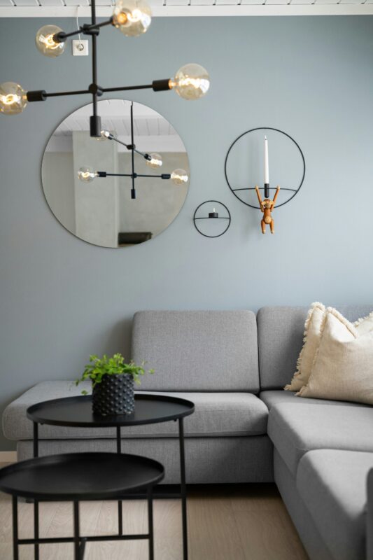
This muted tone adds personality without dominating the space, allowing you to build a soft, layered look.
White decor pieces brighten the room, while light wood furniture enhances the relaxed direction.
If you enjoy a coastal influence, dusty blue pairs well with linen curtains, woven rugs, and pale pastel accents. The combination keeps the room open and breathable.
I once painted a north facing living room this shade, and it instantly softened the cooler light. It created a more balanced environment without darkening the walls.
Dusty blue works well if you want color that feels settled.
Creamy Off-White Walls To Warm Up a Bright Space
Creamy off white provides warmth that pure white sometimes lacks. It keeps your living room bright while introducing a softer undertone.
This shade works particularly well in spaces where stark white feels too sharp. The subtle warmth makes furniture and decor appear richer against the walls.
Pair creamy off white with natural wood finishes, textured fabrics, or woven baskets to build quiet depth. The result looks layered instead of flat.
You can also incorporate darker accents through cushions or artwork to prevent the room from feeling overly pale. The contrast adds interest without competing with the wall color.
I often suggest creamy off white to homeowners who want brightness but prefer a gentler atmosphere. It delivers light while maintaining comfort.
Terracotta Walls For Earthy Character Indoors
Terracotta introduces warmth that you notice immediately when entering a living room. The reddish orange undertone creates an environment that feels expressive and rooted.
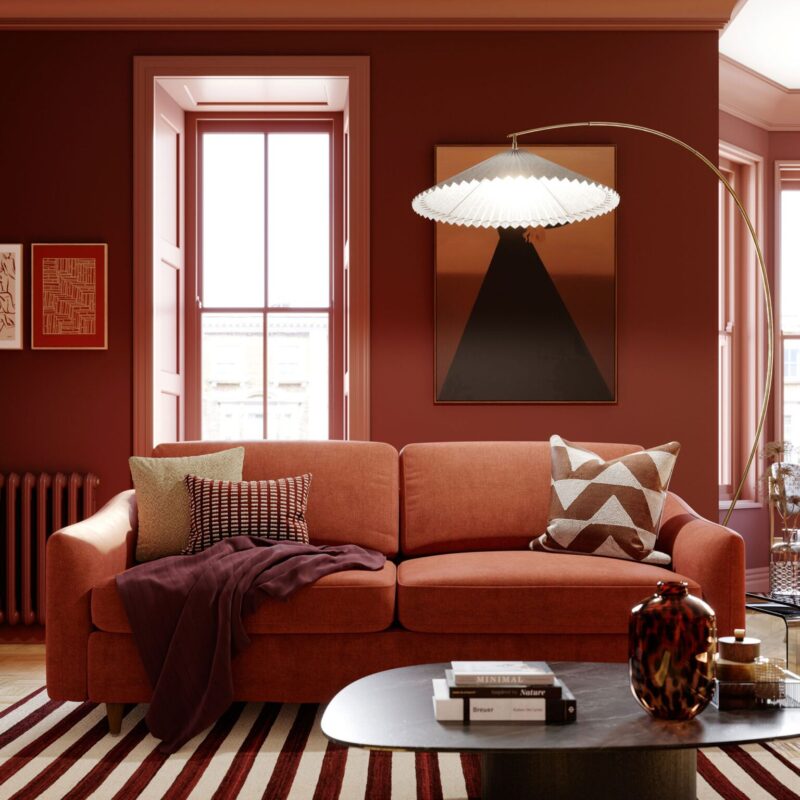
This shade works particularly well in bohemian or Mediterranean inspired interiors where layered textiles and handcrafted decor take center stage.
Patterned rugs and woven wall hangings complement the color naturally.
Green plants stand out beautifully against terracotta walls, adding freshness to the earthy base.
Neutral furniture keeps the room balanced and prevents the palette from becoming too intense.
Because terracotta carries strong personality, it benefits from thoughtful lighting that enhances its richness rather than flattening it.
I have seen this color transform plain white boxes into spaces that feel full of life.
Olive Green Walls To Natural Influence
Olive green brings the outdoors inside in a way that feels mature and steady. It carries depth without becoming too dark.
This shade pairs effortlessly with wood tones, leather seating, and warm metallic accents such as brass or copper. Those materials echo its earthy undertone and strengthen the overall palette.
In eclectic living rooms, olive supports layered decor and mixed textures. You can introduce different shades of green through cushions or artwork to build variation without losing cohesion.
Soft lighting enhances the richness of olive, especially in the evening when the tone appears slightly deeper. Natural fabrics like linen or wool complement it beautifully.
I have always appreciated how olive adapts to changing seasons, working just as well with summer greenery as it does with autumn hues.
Light Taupe Walls That Blend Warmth
Light taupe offers a refined alternative to standard beige or gray, combining the softness of warm undertones with the quiet elegance of cooler neutrals.
It creates a balanced backdrop that feels polished without drawing too much attention to itself.
What makes taupe especially appealing is its flexibility across design styles, whether your living room leans modern, traditional, or somewhere in between.
The subtle mix of brown and gray allows it to shift slightly depending on lighting, which keeps the space visually interesting throughout the day.
Pair light taupe walls with navy or crisp white accents for a clean look. If you prefer a more dramatic edge, black decor elements such as picture frames introduce contrast while maintaining sophistication.
In rooms with natural wood flooring or textured fabrics, taupe enhances those materials.
It acts as a supportive background that allows furniture shapes and finishes to stand out naturally.
I often suggest light taupe to homeowners who want something safe yet elevated, because it delivers depth without the risk of feeling trendy or overpowering.
Blush Pink That Feel Soft
Blush pink brings a gentle warmth into a living room while still maintaining a sense of brightness. Unlike stronger pink tones, this pale shade feels understated.
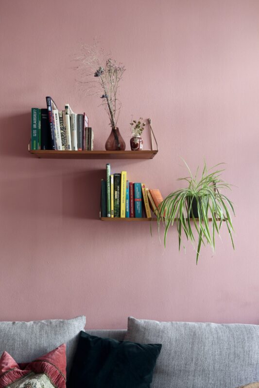
The key to using blush successfully lies in balancing it with grounded elements. Neutral sofas, light oak furniture, or woven textures help tone down any sweetness and give the space a mature direction.
For a more contemporary look, pair blush walls with deep green accents. The contrast sharpens the palette and keeps the room feeling current instead of overly delicate.
Blush also works beautifully with layered textiles such as linen curtains or textured cushions, which enhance its softness without overwhelming the room.
Natural light tends to bring out its warmth, making the space feel welcoming throughout the day.
I have found that blush pink surprises many people with its versatility when styled with clean lines and restrained decor.
Deep Teal Walls That Deliver Rich Depth
Deep teal instantly introduces drama into a living room, blending blue and green undertones into a jewel-like finish that feels confident.
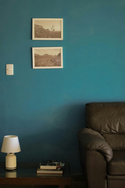
This shade commands attention while still offering enough complexity to remain livable.
Because teal carries both cool and warm qualities, it pairs well with a wide range of materials.
Mid-century modern furniture, brass lighting, and walnut wood finishes all complement its richness.
In eclectic interiors, deep teal provides a strong anchor that supports layered artwork, patterned rugs, and mixed textures. The color prevents the room from feeling scattered by giving everything a cohesive base.
Lighter furniture in cream or soft gray helps maintain visual balance in rooms with limited natural light.
Strategic lighting enhances the depth of teal, highlighting its shifting undertones throughout the evening.
I often recommend deep teal to those who want personality without stepping into bright territory, because it feels bold at the same time.
Mustard Yellow That Bring Playful Energy
Mustard yellow introduces instant warmth and character into a living room, offering a golden tone that feels energetic.
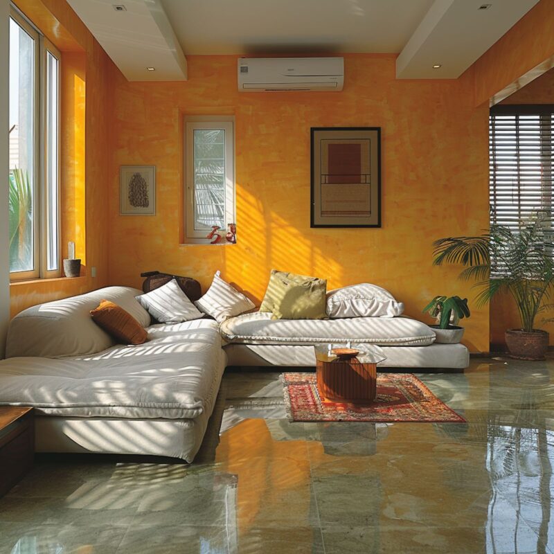
Unlike brighter yellows, mustard carries depth that makes it easier to live with long term.
This shade works especially well in vintage inspired or bohemian interiors where layered patterns and rich materials take center stage.
Dark wood furniture creates contrast, while navy accents enhance the richness of the yellow.
To soften the vibrancy, incorporate neutral textiles such as cream rugs. These elements balance the intensity and keep the space from feeling overstimulating.
Natural light amplifies mustard’s warmth, making the room feel inviting during the day. In the evening, warm lighting enhances its golden undertones.
I have seen mustard completely transform dull spaces into lively gathering areas, especially when paired with thoughtful decor choices that highlight its warmth.
Pale Lavender Walls For a Serene Touch
Pale lavender provides a distinctive yet calming option for living room walls, offering a light purple hue softened by gentle gray undertones. This balance makes it far more versatile than stronger violet shades.

Because of its muted quality, pale lavender pairs beautifully with soft grays, crisp whites, and silver finishes.
Together, these tones create a soothing atmosphere that feels.
For added contrast, deeper purples or touches of green can be layered through cushions, artwork, or decorative accessories. These accents enhance the lavender.
This shade responds particularly well to natural light, which brings out its airy side. In the evening, subtle lighting keeps it from appearing too cool.
I often suggest pale lavender to those seeking something different from traditional neutrals, as it introduces personality while preserving a calm living room environment.
Forest Green Walls To Create a Cozy Retreat
Forest green delivers a deep, enveloping tone that instantly makes a living room feel more intimate.
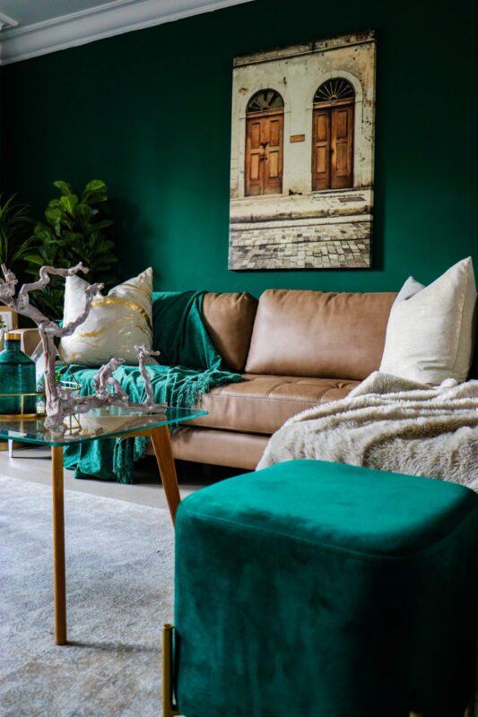
This rich shade reflects the depth of nature, which helps the space feel.
When paired with warm wood tones such as walnut or oak, forest green develops an earthy elegance that feels intentional.
Leather furniture, especially in cognac or chocolate shades, reinforces the natural palette.
Brass accents and warm metallic finishes prevent the green from appearing too heavy. These reflective surfaces catch the light and bring subtle brightness to the darker walls.
You can confidently use forest green on all four walls to create a cocoon-like atmosphere in cozy living rooms designed for relaxation.
If you prefer a softer approach, applying it to an accent wall behind a fireplace or shelving unit introduces drama.
I have seen forest green transform plain rooms into inviting spaces.
Cool Mint Walls That Feel Fresh
Cool mint introduces a crisp and refreshing presence into a living. Its light green undertone adds personality and maintains a sense of openness, too.
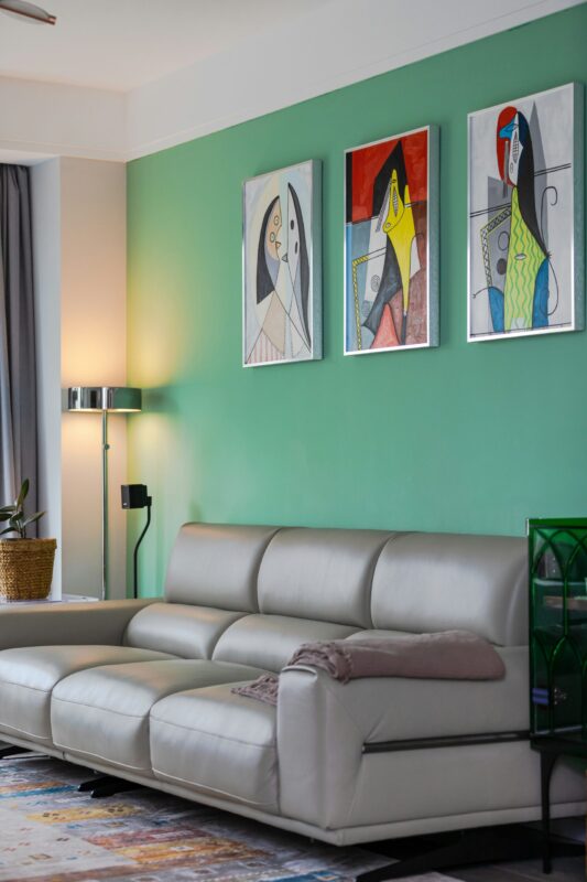
This shade works beautifully in modern or Scandinavian-inspired interiors where simplicity matter.
Paired with white walls, pale woods, and soft gray textiles, mint enhances the airy atmosphere rather than competing with it.
Pastel accents such as blush or soft blue can be layered in to build a playful palette. The overall result feels uplifting, making the room pleasant to spend time in throughout the day.
Natural light amplifies mint’s freshness, especially in rooms with large windows. In artificial lighting, choosing warm bulbs keeps the green from appearing too clinical.
I often recommend cool mint for smaller living rooms because it brings color while still helping the space feel visually expanded.
Deep Brown Walls That Add Warmth
Brown may not be the first color that comes to mind for living room walls, yet when chosen carefully it creates remarkable warmth and depth.
A rich chocolate or espresso tone can make a space feel layered.
This shade pairs exceptionally well with plush fabrics like velvet or chenille, which amplify its luxurious quality. Light-colored sofas or cream rugs provide necessary contrast and prevent the room from feeling overly dark.
Wood furniture blends seamlessly with brown walls, reinforcing a cohesive and grounded look. Metallic accents such as gold or bronze introduce highlights that break up the depth of the color.
Lighting becomes especially important with brown, as layered lamps and ceiling fixtures help maintain balance. When illuminated properly, the shade feels enveloping.
I have seen deep brown work beautifully in larger living rooms where it adds elegance without sacrificing comfort.
Sky Blue Walls That Encourage an Airy Atmosphere
Sky blue brings a gentle, uplifting energy into a living room while keeping the environment relaxed. Its light tone reflects brightness, which helps create a breezy setting.
This shade pairs naturally with soft gray upholstery, building a palette that is balanced. Natural wood tones introduce warmth, preventing the room from feeling overly cool.
In coastal-inspired spaces, sky blue enhances the open and refreshing mood. Layering linen fabrics and woven textures strengthens the relaxed aesthetic.
Because of its softness, sky blue works particularly well in rooms that receive plenty of daylight. Even in smaller spaces, it helps maintain a sense of openness.
I often suggest sky blue for homeowners seeking serenity without relying solely on neutrals, as it introduces color in a soothing way.
Bold Black Walls That Make a Modern Statement
Black walls are unconventional, but when used thoughtfully they create a contemporary living room. This bold choice transforms ordinary spaces into dramatic settings.
In minimalist or industrial-style interiors, black provides a powerful backdrop that emphasizes clean lines.
Light-colored furniture becomes more pronounced against the dark walls, creating strong visual contrast.
Metallic accents such as brass, chrome, or matte gold prevent the room from feeling flat. Large windows and ample natural light are especially helpful in maintaining balance.
Layered lighting is essential with black walls, as floor lamps and pendant lights soften the intensity during the evening.
Textured fabrics like wool or leather keep the space from appearing stark.
When executed carefully, black feels intentional and refined rather than overwhelming.
Bringing Your Living Room Paint Color Ideas Together
Choosing the right living room paint color ideas can feel overwhelming. It also presents an exciting opportunity to define the mood of your home.
Whether you gravitate toward soft neutrals or dramatic tones, the key lies in balancing color with texture, lighting, and furniture choices.
Testing paint samples on your walls allows you to observe how natural and artificial light influence each shade throughout the day.
Small adjustments in undertone can dramatically shift the overall feel of a room.
Do not hesitate to layer textiles, incorporate metallic accents, or mix materials to enhance your chosen color.
With good planning and a bit of experimentation, your living room can reflect the atmosphere you want to create.
FAQs
What is the most versatile paint color for a living room?
Soft gray is highly versatile, pairing well with most furniture styles and accent colors. It adapts easily over time.
How can I make a small living room feel larger with paint?
Light shades like warm beige reflect more light, creating an airy, open feel and making the space appear bigger.
Can I use dark colors in my living room?
Yes, deep shades like navy, charcoal, or forest green can add drama. Pair them with lighter furniture and good lighting to prevent the room from feeling cramped.
How do I choose a paint color that matches my furniture?
Look at the undertones in your existing pieces – warm woods pair well with beige, taupe, or olive tones. Test samples in natural light before committing.