15 Beautiful Color Schemes That Make Your Living Room Feel Massive
A living room can look completely different just from changing the colors. I realized that after helping a friend repaint her dark beige space into a soft olive and cream palette.
The furniture stayed exactly the same, though the room suddenly looked brighter, calmer, and far more expensive.
Color schemes shape the entire atmosphere of a living room. Some combinations bring warmth and coziness, others introduce contrast, drama.
Check out these living room color scheme ideas as they can help transform your ordinary space into one that looks impressive.
Living Room Color Schemes That Will Inspire You
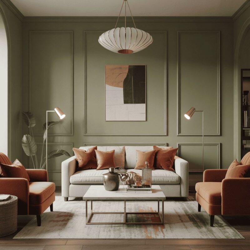
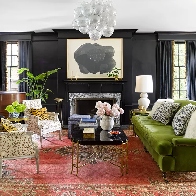
Olive Green + Cream + Black
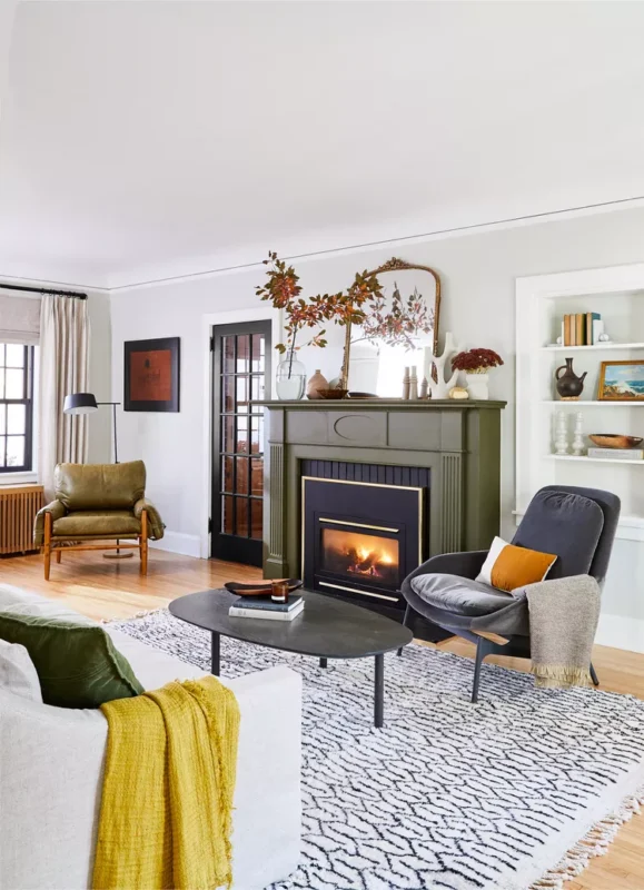
Olive green introduces depth from the start, giving the living room a grounded base that leans earthy and steady.
Cream tones step in to soften that depth, usually appearing on walls, rugs, or larger upholstery pieces. This prevents the darker green from taking over the entire visual field.
Black accents add definition across the room, often through frames, lighting fixtures, or slim furniture details.
These darker elements bring structure and create clear visual breaks between the softer tones.
The combination works best when each color has a defined role rather than being scattered randomly.
Wood finishes sit comfortably within this palette, especially medium or warm tones that sit between cream and olive.
The overall effect leans structured but still approachable, making it suitable for modern, transitional, or nature-inspired interiors.
Pro Tip: Black should stay in smaller, repeated accents instead of large furniture pieces to maintain balance across the palette.
Burnt Orange + Grassy Green + Pastels
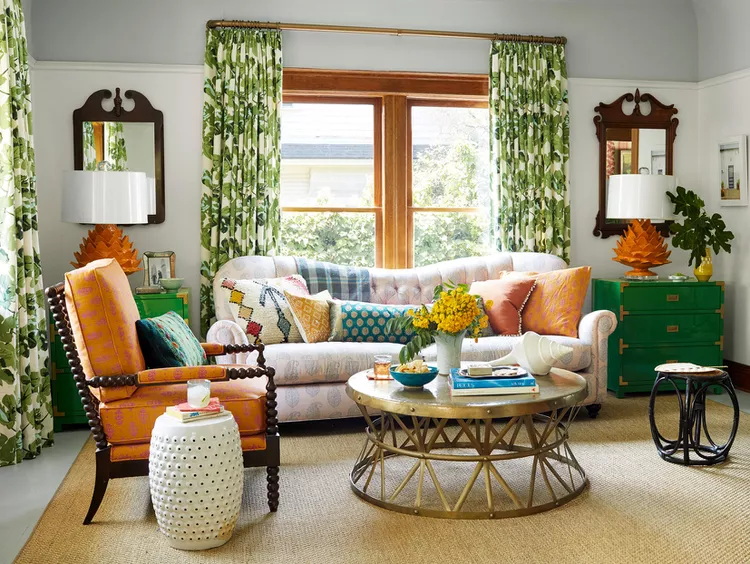
Burnt orange introduces strong warmth immediately, giving the living room an energetic foundation that draws attention.
Grassy green then offsets that intensity with a natural tone that adds freshness and prevents the space from leaning too heavy on warm shades alone.
Pastels enter as the connecting layer, softening transitions between the stronger colors.
Pale pink, light blue, or muted lavender can appear in cushions, artwork, or small décor pieces, helping the palette feel more layered and less intense.
This combination suits expressive interiors where color takes priority over minimalism. It often works in eclectic living rooms that embrace contrast.
Neutral furniture can help stabilize the scheme, especially when large color blocks are present.
The overall effect feels dynamic, with each shade playing a specific role in shaping the room’s personality.
Avoid This: Applying burnt orange on large furniture pieces can overpower the softer pastel elements and disrupt balance.
Oatmeal + Dusty Pink
Oatmeal tones create a soft neutral base that sets a warm, understated foundation across the living room.
Dusty pink then introduces a gentle color shift, often appearing in sofas, cushions, or decorative accents. The combination avoids harsh contrast, leaning instead into a calm, cohesive palette.
This scheme works well in spaces designed for relaxation, where heavy visual contrast is not the goal.
Textured fabrics such as linen, boucle, or soft cotton blends help both colors carry more depth, preventing the room from appearing too flat.
Lighting plays a subtle role here. Natural daylight brings out the warmth in oatmeal tones, while evening lighting deepens the pink accents slightly. The pairing suits smaller living rooms, apartments, or soft modern interiors.
Wooden furniture and light stone finishes usually sit comfortably within this palette, supporting the warmth without distracting from the color relationship.
Pro Tip: Mixing textures in similar tones adds more dimension than introducing extra colors.
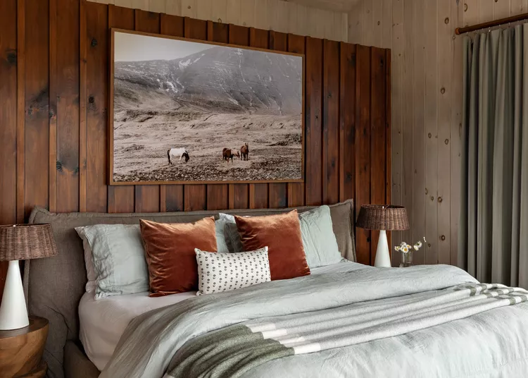
Sage Green + Rust + Brass Accents
Sage green sets a soft, muted base that immediately cools the room down visually, giving walls or large furniture a calm presence that doesn’t dominate the space.
Rust tones then enter as the contrast layer, bringing warmth through cushions, throws, or accent chairs.
The mix creates tension between cool and warm elements, which keeps the room from looking flat or predictable.
Brass details act as the finishing layer, usually appearing in lighting fixtures, mirror frames, or side tables.
The reflective surface picks up both warm and cool tones, helping the palette connect across the room.
Natural textures such as linen upholstery or wooden furniture tend to support this scheme by adding depth.
This combination often suits living rooms that receive good daylight, since the colors shift gently across different times of the day.
The balance between earthy green and warm rust gives the space a collected, lived-in character.
Avoid This: Overloading the room with rust-colored décor can break the balance and overpower the softer sage foundation.
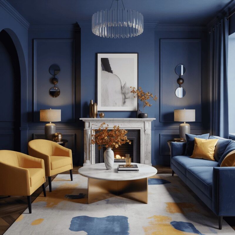
Off-White + Navy + Wood Tones
Off-white sets a bright, open foundation that keeps the living room feeling spacious and clean.
Navy introduces contrast through furniture, rugs, or feature walls, giving the space a strong visual anchor.
Wood tones act as the stabilizing element in this palette. Warm wood finishes connect the coolness of navy with the softness of off-white, creating a balanced transition across the room. The result avoids stark contrast.
This scheme often appears in both modern and classic interiors due to its versatility. Navy adds depth, while off-white maintains clarity. Wood finishes prevent the palette from feeling too cold or rigid.
The combination works especially well in rooms with structured furniture layouts, where each color has a clear zone or purpose.
Avoid This: Expanding navy across multiple large surfaces can reduce brightness and make the room feel visually compressed.
Charcoal Gray + Mustard Yellow + Natural Wood Elements
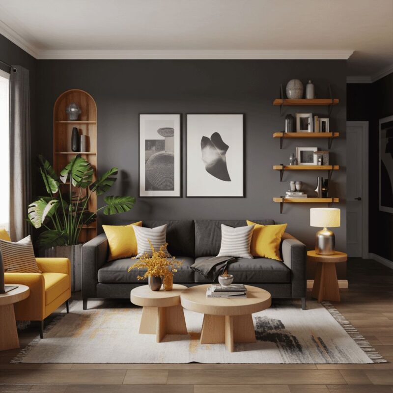
Charcoal gray sets a strong foundation that brings depth into the living room from the start.
It often shows up on sofas, feature walls, or rugs, giving the space a grounded base that holds everything together.
Mustard yellow cuts through that depth with a bold accent. It usually appears in cushions, artwork, or a single chair, adding energy without taking over the entire space.
Natural wood elements soften the contrast between dark and bright tones. Coffee tables, shelving, or flooring in warm wood finishes help connect the palette and stop it from feeling too harsh.
This mix often suits modern or industrial-inspired interiors where contrast plays a central role in design direction.
Avoid This: Covering large areas in charcoal without enough warm wood or yellow accents can make the room appear overly heavy and visually closed in.
Terracotta + Ivory + Jute Textures
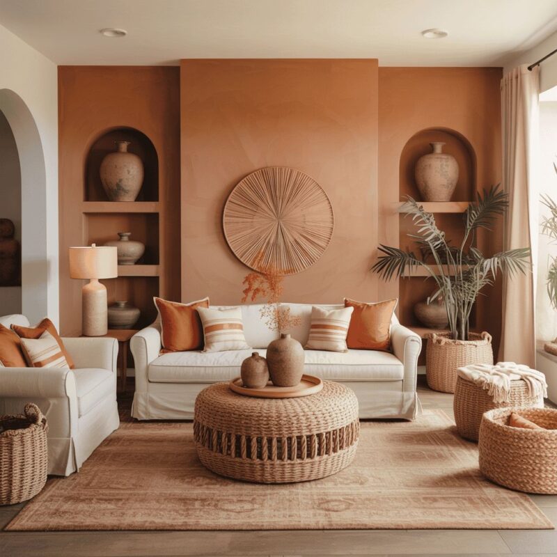
Terracotta brings an earthy warmth that instantly sets a grounded tone in the living room. It often appears in accent walls, pottery, or soft furnishings that carry a sun-baked richness.
Ivory balances that intensity by lifting the palette and keeping larger surfaces light. Walls, sofas, or curtains in ivory help create breathing space across the room.
Jute textures introduce a natural layer that ties everything together. Rugs, baskets, or light fixtures in woven fibers add tactile detail and reinforce the organic direction of the design.
The combination often leans toward Mediterranean or coastal-inspired interiors where natural materials guide the mood.
Avoid This: Using terracotta across multiple large furniture pieces can overpower the lighter ivory base and reduce contrast in the room.
Burgundy + Cream
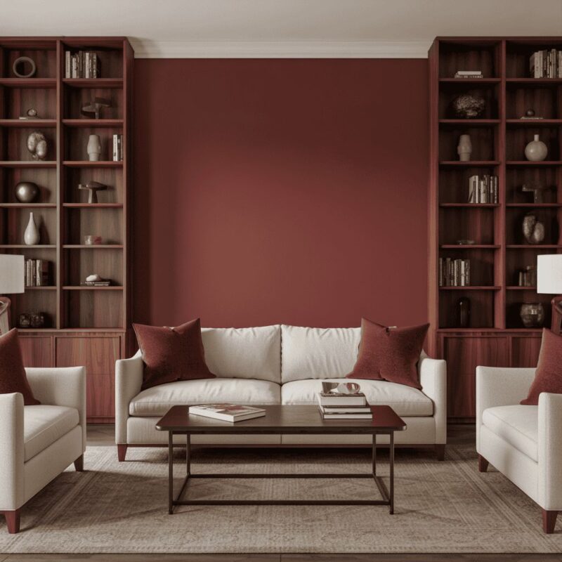
Burgundy brings depth and richness that immediately defines the mood of a living room. It often appears in sofas, curtains, or accent chairs, giving the space a strong visual anchor.
Cream softens that intensity and keeps the overall palette from becoming too dark. It usually dominates walls, rugs, or larger furniture pieces, allowing burgundy accents to stand out clearly.
The contrast between deep wine tones and soft neutrals creates a balanced structure that suits both modern and traditional interiors.
Fabric choice plays an important role here. Velvet enhances the depth of burgundy, while linen or cotton keeps cream surfaces light and airy.
Avoid This: Filling too many large surfaces with burgundy can reduce brightness and make the room feel visually tight.
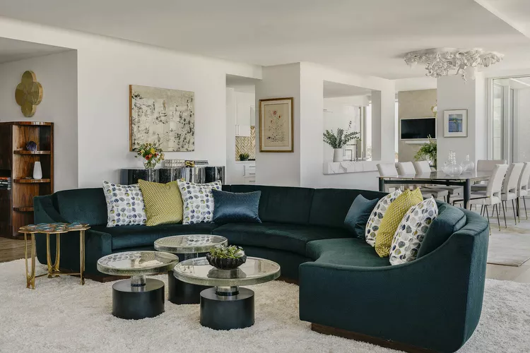
Turquoise + Cool Gray + Brights
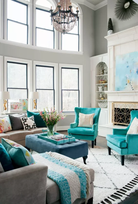
Turquoise introduces a lively tone that instantly shifts the energy of a living room. It often appears in accent walls, cushions, or décor pieces that carry visual weight.
Cool gray steps in as the stabilizing layer. Sofas, rugs, or larger furniture in gray keep the space structured and prevent the brighter tones from taking over.
Bright accents such as yellow, coral, or white add small bursts of contrast across the room. These are usually introduced through décor, artwork, or soft furnishings.
The mix suits expressive interiors where color plays a central role in styling direction.
Avoid This: Adding too many bright accent shades can compete with turquoise and weaken the clarity of the main palette.
Citron Green + Dusty Rose + Charcoal
Citron green brings a sharp, energetic tone that immediately draws attention in any living room. It often appears in statement pieces or decorative elements that set the direction of the palette.
Dusty rose softens that brightness with a muted warmth. It usually shows up in cushions, upholstery, or artwork, creating a gentle contrast against the stronger green.
Charcoal anchors both tones and prevents the palette from drifting into overly bright territory. It works well on sofas, rugs, or structural elements that need visual weight.
Together, the three shades create a layered balance of energy, softness, and depth.
Avoid This: Extending citron green across large furniture pieces can overpower dusty rose and disrupt the overall balance of the palette.
Cottage White + Taupe + Goldenrod
Cottage white sets a soft, airy foundation that keeps the living room bright and open from the start.
It appears on walls, curtains, or large furniture pieces, giving the space a clean backdrop that supports layered color styling.
Taupe steps in as the grounding tone. It adds depth through sofas, rugs, or wooden finishes, preventing the palette from drifting into a purely bright direction. The neutral warmth of taupe helps bridge the lighter and stronger tones.
Goldenrod introduces a lively accent that shifts attention across the room. It usually appears in cushions, artwork, or décor pieces that bring energy into the palette without overwhelming it.
The warm yellow tone pairs naturally with both white and taupe, keeping the combination cohesive.
This scheme often suits cozy, traditional, or farmhouse-inspired interiors where warmth and softness guide the design.
Avoid This: Spreading goldenrod across large furniture pieces can overpower the cottage white base and reduce the calm balance of the palette.
Antique White + Burgundy + Navy Blue
Antique white creates a slightly warm, aged foundation that softens the entire living room. It gives walls and larger surfaces a gentle character that feels less stark than pure white.
Burgundy adds richness and depth through upholstery, cushions, or statement chairs. It introduces a strong visual anchor that draws attention immediately and adds a sense of warmth.
Navy blue balances the palette by introducing structure and contrast. It often appears in rugs, sofas, or accent walls, giving the room a more defined layout.
The combination of burgundy and navy creates a layered contrast that feels bold.
This scheme suits interiors that lean toward classic or slightly formal styling, especially when paired with traditional furniture shapes.
Avoid This: Using both burgundy and navy on large surfaces at the same scale can make the room feel heavy and visually crowded.
Midnight Blue + Ochre + Marble Accents
Midnight blue sets a deep, dramatic base that immediately adds intensity to the living room. It works well on accent walls, sofas, or large rugs, creating a strong visual anchor.
Ochre enters as the warm contrast element. It often appears in cushions, artwork, or decorative pieces, bringing a golden earthiness that softens the depth of the blue.
Marble accents introduce a clean, structured element that breaks up the richness of the darker tones.
Coffee tables, side tables, or décor pieces in marble bring brightness and a polished edge to the palette.
The combination suits modern interiors that rely on contrast between dark, warm, and neutral materials.
Lighting plays an important role here, especially in highlighting marble surfaces and balancing the darker tones.
Avoid This: Too many ochre-heavy accessories can compete with midnight blue and reduce the sharp contrast that defines this palette.
FAQs
How do I choose a living room color scheme that lasts?
Neutral bases like white, cream, or gray tend to age well. Accent colors can then be layered through décor, making updates easier over time.
Can bold colors work in small living rooms?
Yes. The key is control. One strong shade paired with lighter tones usually prevents the space from feeling visually tight or overwhelming.
What’s the easiest way to refresh a living room color scheme?
Cushions, rugs, curtains, and artwork can shift the palette quickly. These pieces allow color changes without repainting or replacing furniture.