7 Things To Know Before Painting With Sherwin-Williams Alabaster
The first time I used Sherwin-Williams Alabaster, I honestly expected just another safe off-white.
Then the afternoon light hit the walls, and the entire room changed. The space looked softer without leaning too yellow or overly stark.
That balance is exactly why Alabaster keeps showing up in so many homes. It carries warmth, but still reads clean.
It brightens darker rooms, softens modern interiors, and pairs easily with wood tones, black accents, natural textures, and layered neutrals.
If you are searching for a timeless paint color that stays versatile across different styles, Sherwin-Williams Alabaster deserves a serious look.
RELATED: 7 Must-Know Things About Greek Villa Sherwin Williams On Walls
Key Characteristics of Sherwin-Williams Alabaster
SW Alabaster (SW 7008) is among the classics. It sits right in that sweet spot between crisp white and creamy neutral.
You’re probably choosing it for that very reason.
In a nutshell, SW Alabaster has the following features:
Off White Color
Alabaster sits in the off-white category, though it carries far more softness than a stark white paint.
The creamy appearance gives rooms a calmer atmosphere and helps interiors look welcoming instead of overly bright.
Its warmth also makes surrounding textures, wood tones, and fabrics appear richer throughout a space.
Undertones
The undertones in Alabaster lean warm, though muted gray keeps the color from turning overly buttery or golden.
This balance helps the paint remain soft and grounded across different interiors.
Depending on lighting, the creamy warmth may appear slightly stronger during the day while still maintaining a neutral overall appearance.
Versatile
Alabaster adapts easily across different surfaces and design styles, which explains its popularity in both modern and traditional homes.
It can soften kitchen cabinets, brighten trim, calm busy wall colors, or create a cohesive exterior palette.
The shade transitions smoothly between rooms instead of looking disconnected from surrounding finishes or décor.
Lighting Impact
Lighting changes the personality of Alabaster throughout the day. Warm lighting enhances its creamy side, creating a cozy atmosphere during evenings.
In cooler or north-facing rooms, the paint still maintains enough depth to avoid looking dull.
That flexibility helps the color stay consistent across changing natural and artificial light.
Where to Use Sherwin-Williams Alabaster Paint in Your Home
Alabaster works across nearly every corner of a home because of its soft adaptable neutral base.
It carries enough creaminess to soften bright light enough for modern and traditional interiors.
From main living spaces to private rooms, it adjusts easily to different décor styles to create visual continuity throughout the home.
Let’s see where and how to incorporate Alabaster in homes.
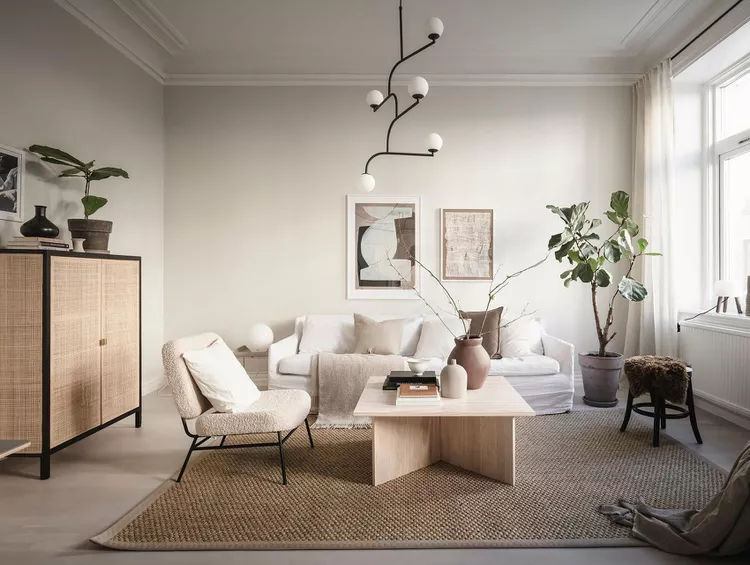
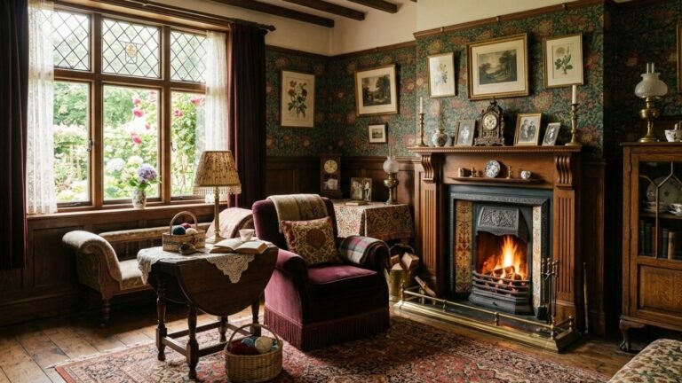
In Living and Dining Rooms
Living areas benefit strongly from Alabaster since these spaces serve as gathering points.
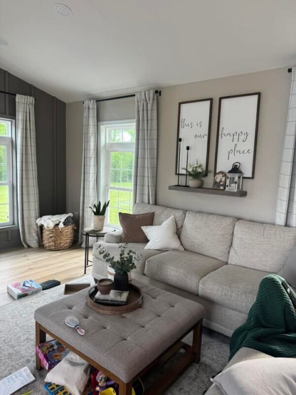
The color sets a calm foundation that supports layered textures and mixed materials without visual overload.
Linen upholstery, beige or white curtains, and natural wood furniture blend easily into this palette.
In dining rooms, Alabaster walls help highlight table settings, artwork, and lighting fixtures. It also combines nicely with both warm metallics and matte finishes, depending on the desired mood.
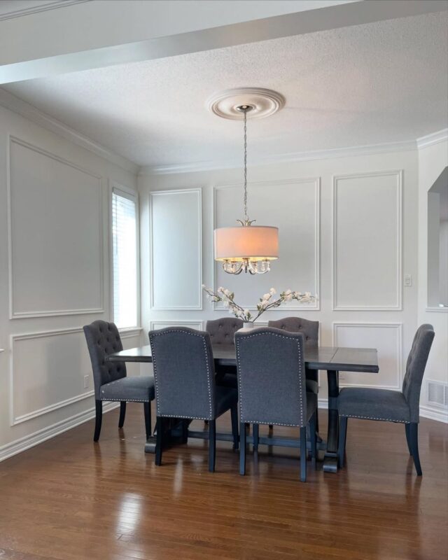
Fireplaces stand out beautifully against this backdrop when paired with stone or rustic wood mantels.
Mirrors and greenery further enhance openness, giving shared spaces a bright atmosphere.
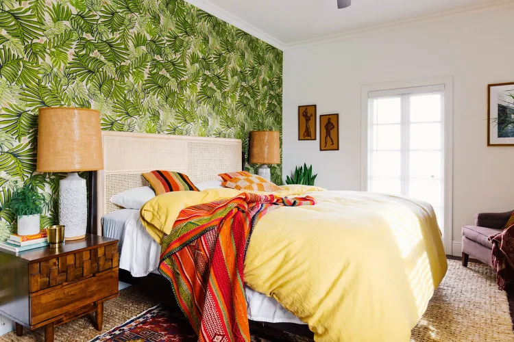
In Bedrooms
Bedrooms painted in Alabaster often take on a soft, restful character.
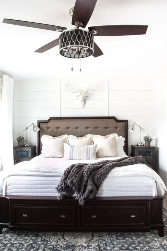
The warm undertone supports a calming environment when used with layered bedding in muted tones like ivory, taupe, or soft gray. It allows textures such as cotton, linen, and wool to stand out gently.
Accent walls can be introduced in deeper neutrals if contrast is desired, though the full-room application maintains a cohesive look.
Lighting choices also play an important role, with warm fixtures enhancing the creamy quality of the paint.
Black or bronze accents in lamps and hardware introduce subtle contrast while maintaining balance.
Kitchens
Kitchens painted in Alabaster often feel brighter in spaces that rely heavily on natural light.
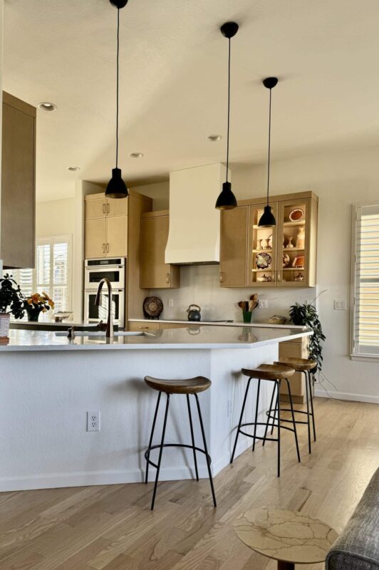
The color works well on walls, cabinets, or even both, depending on the design approach. It pairs naturally with marble countertops, wooden accents, and brass or gold hardware.
The soft cream tone helps reduce the harshness often found in purely white kitchens, creating a welcoming atmosphere.
The paint as well complements both modern and farmhouse-style layouts. Hardwood flooring enhances the overall warmth, making the kitchen comfortable for daily use.
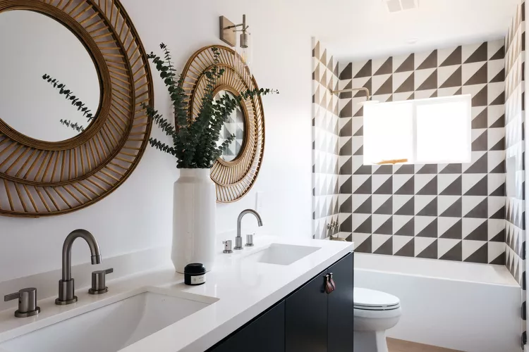
Bathrooms
Bathrooms painted in Alabaster gain a clean yet softened appearance that avoids the clinical feel of bright white.
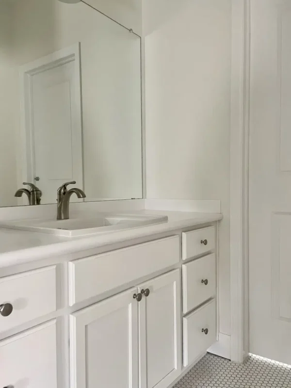
The warm undertone works well with tile, marble, and ceramic surfaces, especially in neutral or earthy palettes.
It enhances natural light in smaller bathrooms, making them appear more open. In larger spaces, it supports spa-like styling when paired with wood accents, brushed metal fixtures, or soft textiles.
Mirrors and glass elements reflect its warmth to add depth.
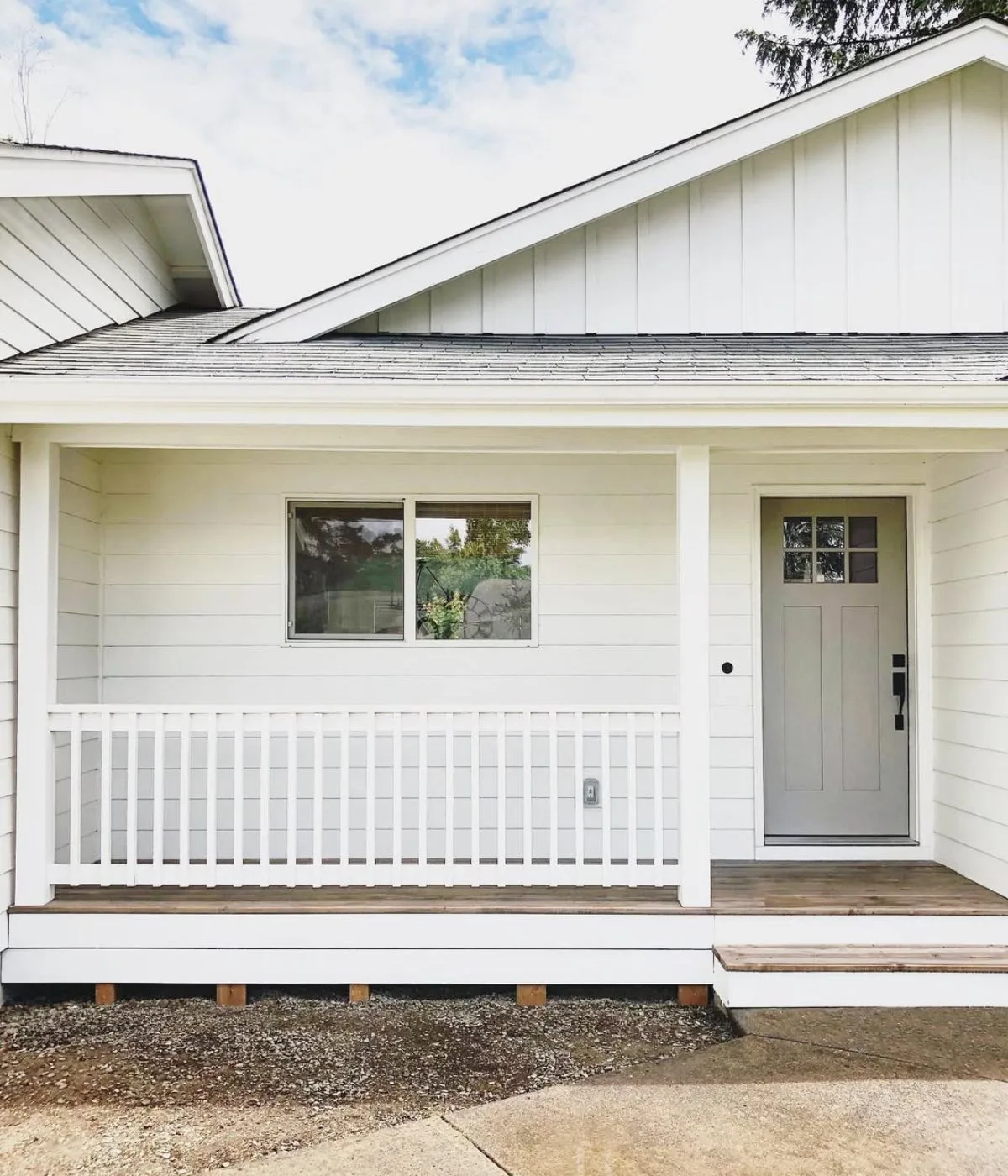
Exteriors
On exteriors, Alabaster introduces a soft, welcoming presence that works across different architectural styles.
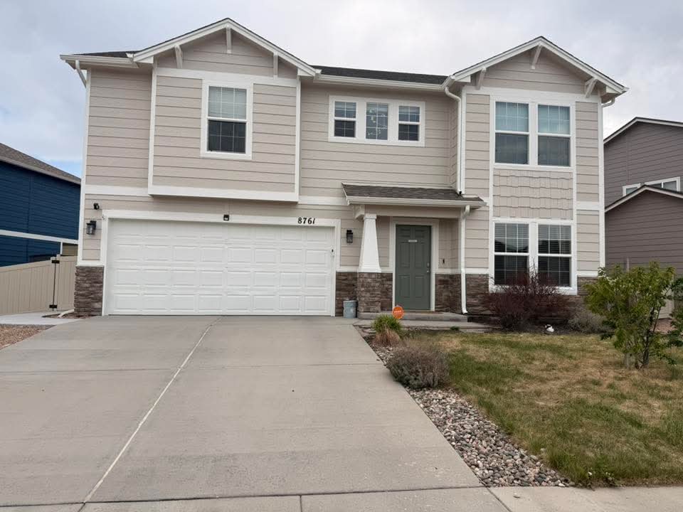
It reflects light gently, preventing buildings from appearing too stark under strong sunlight. This makes it a popular choice for contemporary homes.
Alabaster does well with darker trims in charcoal, brown, or black, creating contrast without harshness.
Natural materials like stone, wood, and brick also blend well with its warm undertone.
Roof tiles in earthy shades further complete the exterior palette, giving the home a balanced street presence.
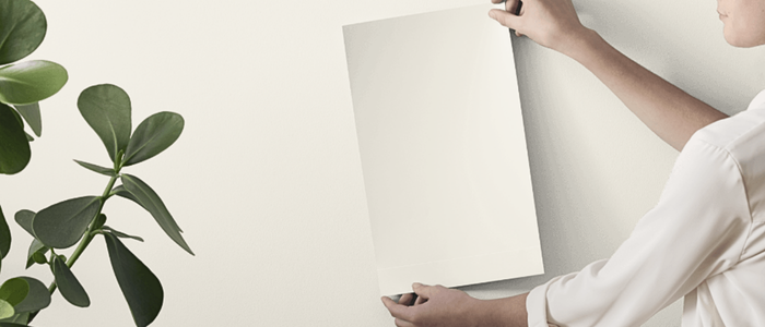
How to Best Sample This SW Alabaster?
Testing Sherwin-Williams Alabaster at home gives a clearer picture of how it reacts to real lighting conditions.
The shade can shift depending on sunlight direction, artificial lighting, and surrounding materials, so sampling helps avoid guesswork before painting full surfaces.
In the past, sampling involved painting large poster boards or testing patches directly on walls, which often created inconsistency. A more modern option now simplifies the process.
Samplize peel-and-stick samples come pre-painted with two coats of real paint from the manufacturer.
Each sample measures 9” x 14”, giving enough surface area to evaluate the color properly in different lighting conditions.
They arrive ready to use, often delivered overnight. The color accuracy closely matches the final paint result, making evaluation more reliable.
This method costs less than buying multiple sample pots and eliminates cleanup, wasted paint, and disposal concerns.
It also allows easy movement between rooms to compare how Alabaster behaves in different spaces before making a final decision.
7 Key Tips For Painting With SW Alabaster
When using this paint, you need to put some key things into consideration:
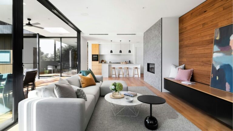
1. Pair Alabaster with Medium-Toned Wood Floors
Alabaster works amazingly when paired with medium-toned wood flooring. The warmth in the paint connects naturally with oak, creating a grounded interior base that avoids stark contrast.
Medium wood tones introduce depth beneath the soft off-white walls, giving rooms a layered and cohesive appearance.
This combination also helps prevent spaces from looking overly pale or washed out. The slight richness in the flooring adds structure, which complements the creamy nature of Alabaster.
In living rooms, bedrooms, and open-plan areas, this pairing supports a calm but visually steady foundation.
Furniture in neutral fabrics or soft textures sits easily within this palette. Rugs in beige, taupe, or muted patterns can further tie the look together.
The result is a warm, balanced interior that feels intentional and grounded.
2. Prep Your Walls Carefully for Smooth Coverage
Proper wall preparation plays a major role in how Alabaster appears once applied.
Smooth surfaces allow the paint to reflect light evenly, preventing uneven patches or texture inconsistencies.
Cleaning walls thoroughly removes dust, oils, or residue that could affect adhesion.
Any cracks, dents, or rough areas should be filled and sanded before painting begins. This step ensures the creamy tone of Alabaster remains consistent across the entire surface.
Primer application can also improve coverage on darker or previously colored walls.
Well-prepped walls help the paint achieve its intended softness and clarity. Without this step, imperfections may become more noticeable once the paint dries in natural daylight.
Taking time during preparation improves both durability and visual finish, giving the final result a cleaner, refined appearance.
3. Test Alabaster Under Natural and Artificial Light
Alabaster shifts subtly depending on lighting conditions, making testing an important step before full application.
Natural daylight often brings out its soft cream undertone, especially in afternoon light.
North-facing rooms may show a slightly cooler variation, while south-facing spaces enhance its warmth.
Artificial lighting also changes its appearance. Warm bulbs deepen the creamy quality, creating a cozy atmosphere during evenings.
Cooler LED lighting can introduce a more neutral or slightly muted look.
Testing samples across different rooms helps reveal these variations clearly. Observing the paint at different times of day provides an accurate understanding of how it will behave long-term.
This step ensures the chosen color aligns with the mood intended for each space in the home.
4. Use Alabaster with White or Light Gray Cabinetry
Alabaster pairs seamlessly with white or light gray cabinetry, creating a soft, layered kitchen or bathroom palette.
The subtle contrast between surfaces prevents the space from looking flat, while still maintaining a cohesive neutral theme.
White cabinetry enhances brightness, allowing Alabaster walls to introduce gentle warmth.
Light gray adds a slightly cooler contrast, which helps balance the creamy undertone of the paint.
Together, these combinations create a refined and modern look suitable for various interior styles.
Hardware choices also influence the final effect. Brass or gold accents lean toward warmth, while chrome black introduces sharper definition.
Countertop materials like quartz blend easily into this palette, reinforcing a structured appearance without overwhelming the softness of the wall color.
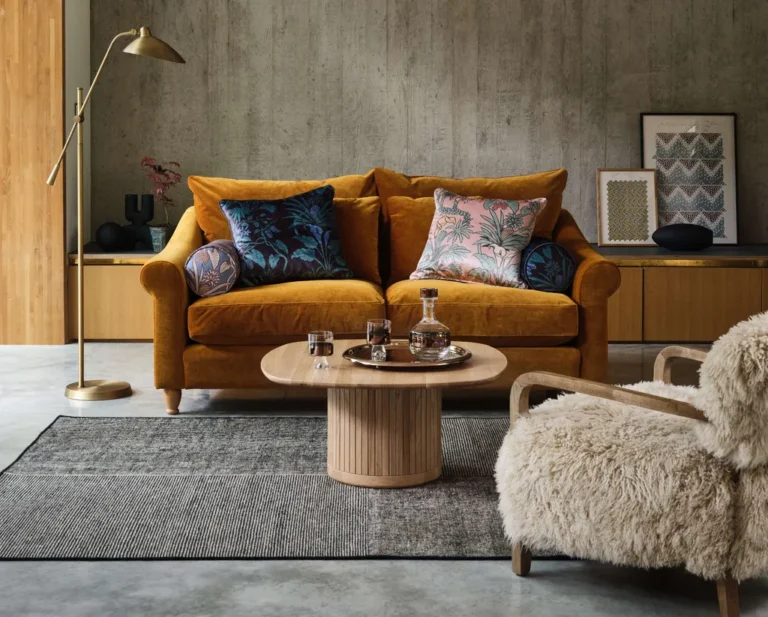
5. Use Soft, Neutral Accents to Avoid Coldness
Alabaster already carries warmth, but surrounding it with overly stark elements can shift the atmosphere toward a cooler direction.
Soft, neutral accents help maintain its impressive character across different spaces in the home.
Textiles in beige, cream, taupe, or muted earth tones work alongside this paint. These shades prevent visual harshness and support a layered, comfortable interior.
Furniture with natural fabrics like linen or cotton adds texture without disrupting the color harmony.
Decor elements such as woven baskets, wood finishes, and soft-toned ceramics further reinforce warmth.
Avoiding overly sharp contrasts allows Alabaster to remain consistent in tone, keeping rooms visually connected and easy on the eye.
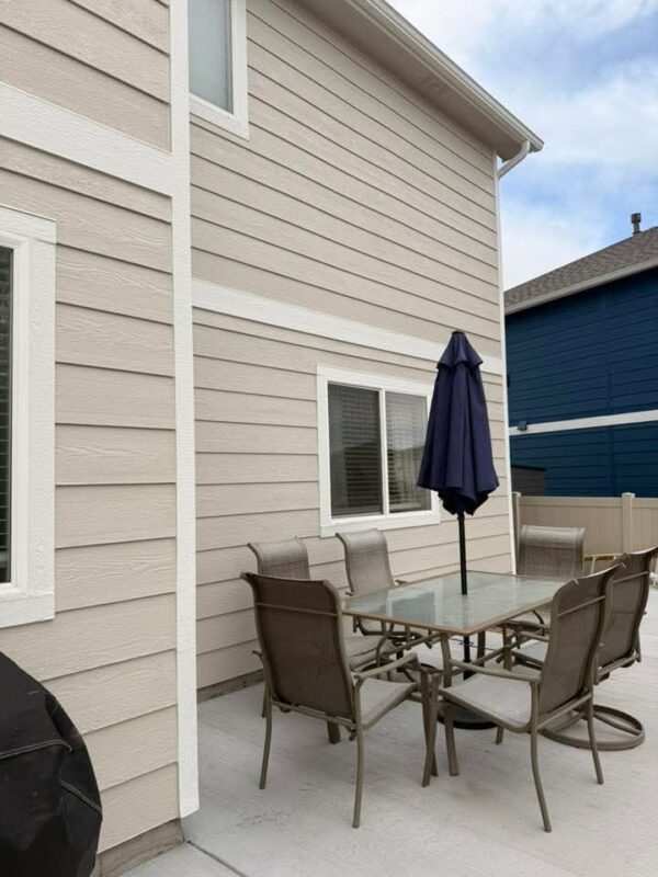
6. Consider Alabaster for Exteriors with Natural Stone or Brick
Alabaster performs well on exteriors, especially when paired with natural materials like stone or brick.
Its soft off-white tone enhances architectural details. This creates a refined exterior presence that is well grounded.
Stone elements gain subtle contrast against Alabaster, allowing natural variations in color to shine
Brick surfaces also benefit, as the paint softens their intensity while maintaining character. Trim, shutters, and rooflines appear defined against this neutral backdrop.
The color adapts easily to different architectural styles, from traditional homes to more modern builds.
Its warmth prevents the exterior from looking overly stark in bright sunlight, supporting a balanced curb appeal throughout changing weather conditions.
7. Apply Multiple Thin Coats for a Flawless Finish
Applying multiple thin coats of Alabaster improves coverage and enhances the final finish.
Thin layers allow the paint to settle evenly, reducing streaks that may appear with thicker applications.
Each coat builds depth gradually, helping the creamy undertone develop more consistently across walls.
This approach also improves durability, allowing the paint to adhere properly to the surface over time.
Rushing with heavy coats can lead to drips or texture inconsistencies in well-lit areas where imperfections become more visible.
Allowing proper drying time between layers ensures a smoother final appearance.
The result is a cleaner, more professional finish that highlights the softness of Alabaster across different rooms.
Best Coordinating Colors for Sherwin-Williams Alabaster
Alabaster pairs well with a wide range of colors because of its soft warm base.
It adapts easily to both calm neutral palettes and richer accent tones, making it a flexible foundation for interior and exterior design choices.
Warm Neutrals
Warm neutrals sit closest to Alabaster on the color scale, creating a smooth palette.
Shades like Accessible Beige, Natural Linen, and Balanced Beige blend easily without creating sharp contrast.
These tones support layered interiors where softness and continuity matter.
Wood finishes, linen fabrics also sit comfortably within this group, helping rooms stay visually steady across different lighting conditions.
Soft Grays
Soft gray shades introduce a cooler balance that contrasts gently with Alabaster’s warmth.
Colors such as Agreeable Gray, Repose Gray, and Light French Gray work well on adjacent walls, cabinetry, or trim.
This pairing creates subtle variation. The contrast stays controlled, allowing both colors to hold their character while maintaining a consistent visual flow throughout a space.
Earthy Tones
Earth-inspired colors bring richness next to Alabaster. Terracotta, muted olive, clay brown, and soft rust tones introduce warmth that complements its creamy base.
These shades work well in accent walls, textiles, or décor pieces. They add personality without overwhelming the softness of Alabaster, making spaces feel layered.
Deep Accents
Deeper shades add structure and visual weight alongside Alabaster. Navy, charcoal, forest green, and espresso brown create contrast that highlights architectural details and furniture pieces.
These tones are often used in smaller doses through doors, cabinetry, or feature walls.
The contrast remains balanced, giving rooms a sharper visual rhythm while Alabaster keeps the overall palette steady.
Sherwin-Williams Alabaster Vs Greek Villa
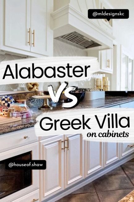
Sherwin-Williams Alabaster and Sherwin-Williams Greek Villa sit close within the off-white family, both leaning warm and creamy.
They often get compared because they deliver a similar soft, neutral backdrop across interiors. However, a few differences affect how each performs in a space.
Greek Villa carries a slightly higher Light Reflectance Value of 84, which pushes it a touch brighter than Alabaster. This extra brightness can make rooms appear lighter and a bit more open in spaces that need added illumination. It still maintains a warm base, though the appearance trends a bit closer to a soft ivory.
Alabaster holds a softer, more muted warmth. It tends to read slightly creamier, which gives interiors a settled look. This quality makes it a frequent choice for homes that want warmth without leaning too bright or yellow.
Lighting plays a key role when comparing both shades. Greek Villa can show more warmth under incandescent lighting, sometimes shifting toward a gentle yellow tint. Alabaster responds in a more balanced way, holding its softness across different lighting types.
In terms of coordination, both colors share a similar palette range. Neutrals, soft grays, earthy tones, and deeper accents complement each equally well.
Either of these two is flexible for full-home design schemes.