11 Modern Coastal Dining Room Ideas

The first time I tried styling a dining room with a coastal touch, it felt slightly off.
Light colors were there, a few beach-inspired pieces too, but the space lacked structure and didn’t come together the way I expected.
Modern coastal dining rooms aren’t built on obvious seaside decor. The real impact comes from soft tones, layered textures, and natural materials that create a calm setting.
Once those elements start working together, the entire space shifts. It begins to look styled, setting the tone for every meal shared there.
These 11 modern coastal dining room ideas will keep you updated.
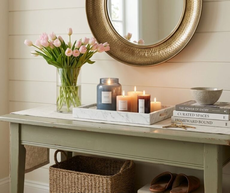
Decor Ideas For Coastal Living Room
Palm View + Powder Blues
Soft blue tones paired with palm elements instantly reshape a dining space. This combination brings a light, airy presence that reads clean instead of overly styled.
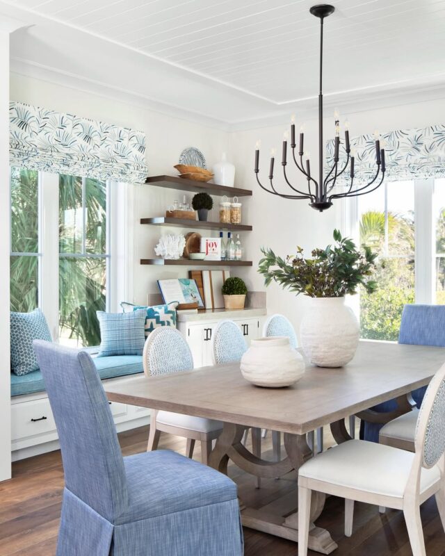
Powder blue works best when kept slightly muted, allowing it to blend smoothly across walls, upholstery, or small accents.
Palm details should stay intentional. A single large plant, a framed outdoor view, or artwork can introduce that tropical layer without taking over the room. This keeps the space refined.
Furniture choices matter here. Light wood tables, woven seating, and linen textures create contrast against the cool tones.
Each piece adds depth, giving the room a composed, layered look instead of a flat finish.
When these elements align, the dining area looks open and polished, with just enough character to stand out.
Pro Tip: Stick to one dominant blue tone, then repeat it in small touches across the space to create a consistent visual thread.
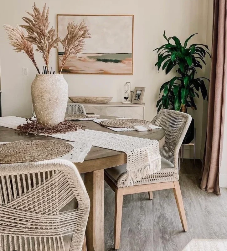
Natural, Sandy Tones
Warm neutrals can shape a dining room into a calm, grounded space.
Sandy tones draw inspiration from coastal landscapes, using beige, cream, and soft taupe to build depth through variation.
The strength of this style lies in layering. A wooden table with a slightly aged finish pairs well with linen or woven chairs.
Add texture through rugs, ceramics, or light fabric accents to prevent the space from looking flat.
Lighting plays a key role here. Daylight enhances the warmth of these tones, giving the room a bright, relaxed appearance.
In the evening, softer lighting deepens the palette, creating a more intimate setting.
This approach suits anyone drawn to a timeless look that doesn’t rely on bold color or seasonal shifts.
Pro Tip: Combine at least three neutral shades across furniture and decor to create dimension and avoid a one-tone result.
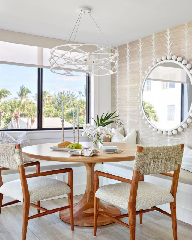
Playful & Palm-Framed
A touch of playfulness can bring new life into a structured dining space. This idea blends clean design with palm elements, creating a setting that feels lively.
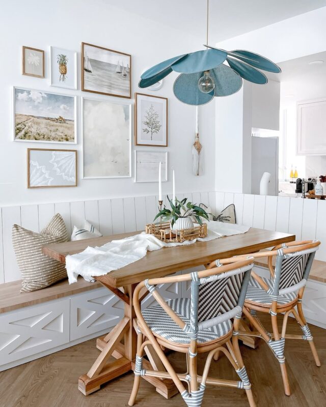
Palm details should act as highlights, not the main focus. A single plant near the dining table, a window view framed by greenery, can introduce that tropical edge in a refined way.
Color choices can stretch slightly beyond strict neutrals here. Soft greens, warm whites, and natural wood tones create a balanced palette that adds character through contrast.
Furniture should stay simple to anchor the space. Clean lines, minimal shapes, and uncluttered surfaces keep everything cohesive while allowing those playful touches to stand out.
This setup suits spaces that need energy without losing structure.
Pro Tip: Choose one standout feature, such as a bold plant or framed view, and let it anchor the entire look.
Brunch With a Breeze
Morning light can completely transform a dining area. A space designed for relaxed brunch moments focuses on openness, soft textures, and a layout that encourages easy gatherings.
Start with a neutral base, then build in comfort through materials. Light wood finishes, soft seating, and simple table settings create an environment that looks ready for daily use.
Airflow and light movement shape this concept. Sheer curtains, open layouts, or nearby outdoor access allow brightness to move freely, highlighting textures.
Details should stay minimal. Woven placemats, ceramic dishes, and a simple centerpiece can add character without cluttering the table.
This type of dining space naturally draws people in, making it ideal for slow mornings and casual meals.
Pro Tip: Keep decor flexible so the table can shift easily between everyday use and slightly styled settings.
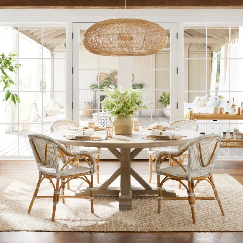
Breezy Nook with a View
A small corner can become the most inviting dining spot in a home. A breezy nook with a view turns limited space into a defined, intentional area that amazes through smart placement.
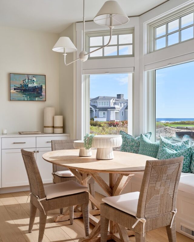
Positioning makes the biggest difference. Setting the table near a window or outdoor view adds depth and visual interest.
Even a simple backdrop of greenery or sky can elevate the entire setup.
Furniture should match the scale. A round or slim table paired with lightweight chairs keeps the area open. Avoid bulky pieces that crowd the space.
Soft additions like cushions or light drapery bring comfort while keeping the overall look relaxed. Every element should support openness rather than closing the space in.
This approach proves that size doesn’t limit impact when layout and materials are chosen carefully.
Pro Tip: Use reflective surfaces like glass or light-finished wood to brighten the nook and enhance the sense of space.
Light Blue Tones
Soft blue shades can redefine a dining space with calm structure and quiet character. This palette leans into airy color, creating a setting that stays visually light across the entire room.
Light blue works well on walls, seating accents, or decorative pieces that support the overall theme.
The strength of this approach comes from restraint. Instead of layering heavy color, the design relies on gentle variation within the same family of tones.
Natural materials pair naturally here. Pale wood tables, linen upholstery, and matte ceramics help ground the cooler palette, keeping the space gorgeous.
Each element contributes to a composed look that never turns cluttered.
This direction suits dining areas that aim for clarity and openness, especially in spaces that receive strong daylight.
Pro Tip: Repeat one specific shade of light blue in at least three different elements to create visual continuity across the room.
Crisp White with Touches of Greenery
Bright white foundations can completely transform a dining space when paired with natural greenery.
The white base sets a clean structure, allowing surrounding details to shine with clarity and precision.
Green accents introduce life into the space without overpowering it. A few well-placed plants, a simple vase arrangement, or trailing greenery near windows can shift the entire atmosphere toward a more natural direction.
Light-toned wood, woven seating, or matte finishes help soften the brightness of white surfaces. This balance prevents the space from looking sterile and adds warmth through texture.
The overall effect is sharp, fresh, and easy to maintain visually. It works especially well in rooms that rely on natural light to enhance their structure.
Pro Tip: Limit greenery to a few intentional spots rather than spreading it throughout the entire room for a cleaner composition.
Crossback Chairs & Natural Tones
Crossback chairs bring instant character to a dining space through their curved structure and rustic influence.
When paired with natural tones, they create a grounded setup that feels structured without appearing rigid.
The wood finish of these chairs pairs naturally with neutral tables, linen accents, and woven textures.
This combination builds a layered environment where each material supports the next without competition.
Color stays restrained in this direction. Soft beige, muted browns, and warm whites allow the furniture to take visual priority.
The result is a layout that emphasizes material and form over bold color choices.
This setup fits well in dining areas that aim for a slightly rustic coastal influence while maintaining modern clarity.
Pro Tip: Keep surrounding furniture simple so the crossback chair design remains the visual anchor of the space.
Different Tones of Blue
Layering blue shades creates depth that single-tone palettes cannot achieve. This approach uses variation across light, mid, and deeper blues to build a structured dining environment.
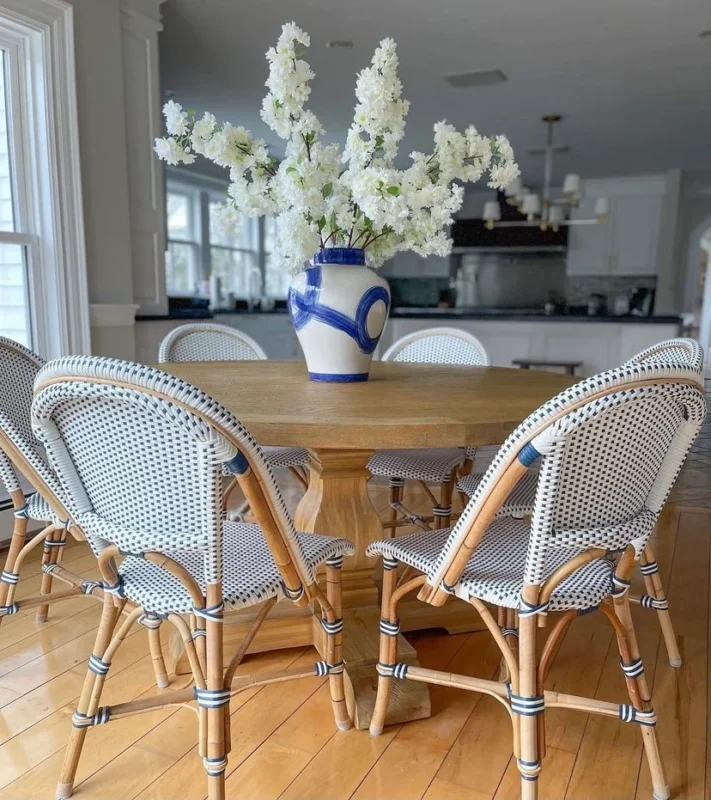
Instead of relying on patterns, the design focuses on tonal shifts. A pale blue wall, deeper blue seating accents, and soft decorative elements create movement.
Neutral bases help stabilize the palette. White, sand, or light wood tones prevent the blues from becoming too heavy and maintain balance throughout the space.
This direction works particularly well in dining rooms that aim for a coastal influence without leaning into literal beach themes.
Pro Tip: Combine at least three distinct blue tones, but keep saturation consistent to avoid visual imbalance.
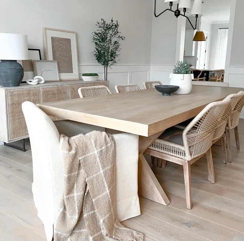
Natural Textured, Woven Chairs
Texture brings depth into dining spaces where color stays minimal. Woven chairs introduce natural materiality that instantly softens the overall look of a room.
The woven structure adds visual complexity through pattern and surface variation, making even simple layouts appear more considered.
When combines with neutral tables and soft-toned surroundings, the chairs become a defining element.
This style works well in coastal-inspired dining rooms that rely on natural materials rather than bold decoration. The focus stays on craftsmanship and texture instead of color contrast.
Lighting also enhances this setup. Natural daylight highlights the woven details, giving the furniture more definition throughout the day.
Pro Tip: Pair woven seating with smooth table surfaces to create contrast between texture and structure.
Go White with It
A fully white dining space creates a strong sense of clarity. This approach uses a unified color foundation across walls, furniture, and decor to establish a clean, uninterrupted visual flow.
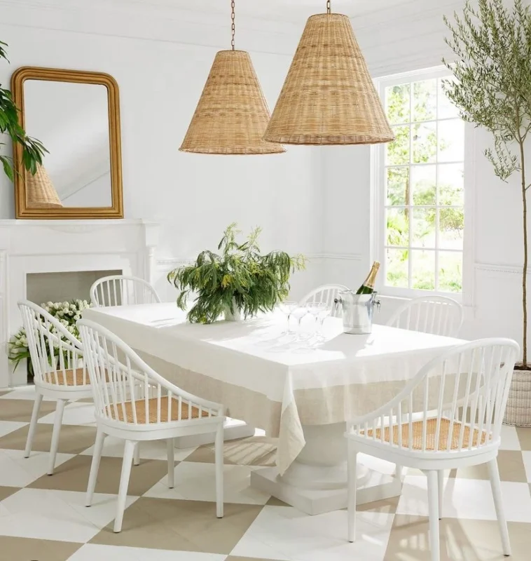
The success of this style depends on variation in material. Matte finishes, glossy accents, linen fabrics, and ceramic details introduce subtle contrast that prevents the space from appearing flat.
Natural light plays a central role here, shaping how the room reads at different times of day. Morning light enhances brightness, while evening tones soften the overall effect.
To avoid monotony, small shifts in texture become essential. A mix of smooth and tactile surfaces adds quiet depth.
Pro Tip: Introduce at least three different textures within the same white palette to maintain dimension and avoid a flat visual result.