13 Two-Tone Kitchen Cabinet Ideas
Your kitchen can change fast with the right cabinet colors. Two-tone cabinets give you a simple way to add contrast and break up a flat layout.
You don’t need a full remodel to make it work. A smart mix of light and dark, or painted and natural finishes, can shift the entire look.
These two tone kitchen cabinet ideas show how to combine colors with purpose. Each one offers a clear direction you can use in your own space.
Best Ideas For Two-Tone Kitchen Cabinets
Dark Stained Wood + White Cabinets
Dark stained wood paired with white cabinets creates a strong contrast that instantly defines the kitchen.
The richness of the wood grounds the space, while white keeps it from feeling too heavy.
You can place the darker tone on lower cabinets to anchor the room. This keeps the upper area light and helps the kitchen feel more open, especially in smaller layouts.
That balance becomes clear as you move through the space.
The eye naturally shifts between the two tones, which adds depth without needing extra decoration. Even simple hardware can stand out more against this mix.
It also works across different styles. Whether your kitchen leans modern or slightly classic, this pairing adapts easily.
The contrast stays timeless, and it gives you room to adjust other details over time.
Glossy White + Matte Wood Finish
This combination plays with texture as much as color. Glossy white cabinets reflect light, which can brighten the entire kitchen, especially if natural light is limited.
Matte wood, on the other hand, adds a softer and more grounded look.
When these two finishes sit side by side, the difference becomes noticeable in a good way. The shine from the white surfaces keeps things fresh, while the wood tones add warmth.
Placement can change the effect.
Glossy white often works well on upper cabinets or along longer walls. Matte wood can then be used below or on an island to create contrast that is steady.
You don’t need to add much else. The mix of finishes already brings enough interest, so the rest of the kitchen can stay simple.
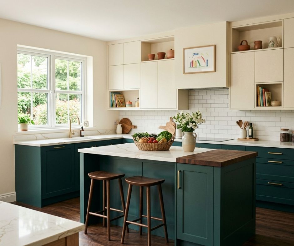
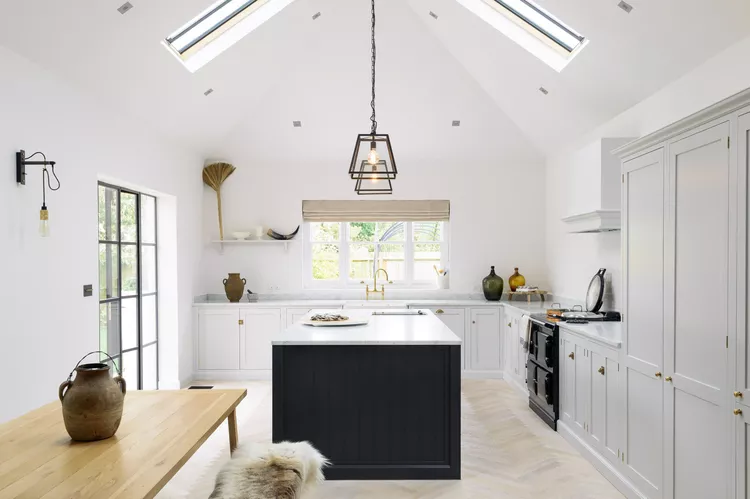
Oyster Upper Cabinets + Charcoal Island
Using a soft oyster tone for upper cabinets keeps the kitchen light, but with more depth than plain white. It brings a slightly warmer look that still neutral.
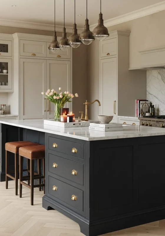
Then the island shifts the tone completely.
A deep charcoal island becomes the focal point, drawing attention to the center of the room. This contrast creates a clear visual break between the perimeter and the workspace.
It also helps define different areas in an open layout.
The upper cabinets stay quiet and subtle, allowing the island to carry more weight. This makes the space feel more organized.
Small details can tie everything together. Hardware, lighting, or even bar stools in darker finishes can echo the charcoal tone.
That connection keeps the design from feeling disconnected and makes the whole kitchen cutel.
Oak Island + White Cabinets
An oak island paired with white cabinets brings warmth into a clean kitchen setup. The natural grain of oak adds texture that painted surfaces often lack.
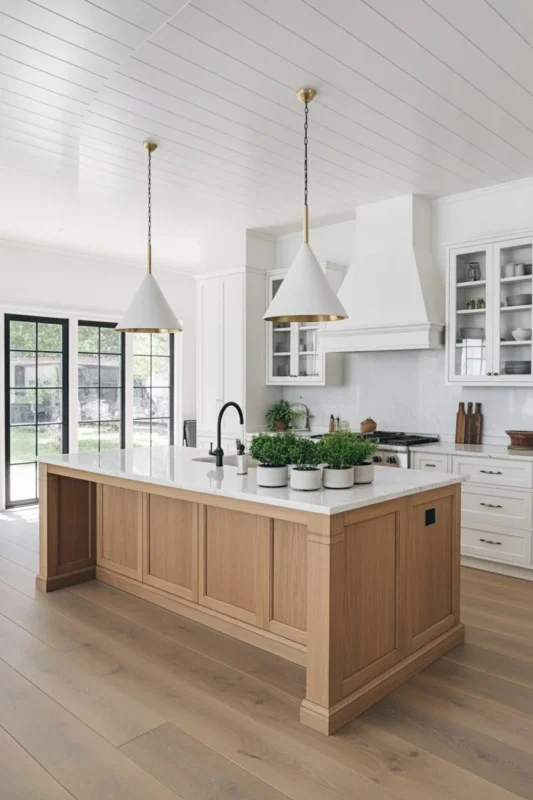
White cabinets keep the room bright. They act as a simple backdrop, allowing the island to take center stage. This works especially well if you want a kitchen that is open but still has character.
The island becomes more than just a workspace. It can serve as a gathering spot, a prep area, or even a casual dining space. The wood finish makes it more inviting.
You can build on this look with small details. Wood accents in stools or open shelving can echo the island, helping everything get connected.
Navy Upper Cabinets + Calacatta Marble Island
Navy upper cabinets bring a bold touch to a kitchen. They draw the eye upward and add depth to the overall design.
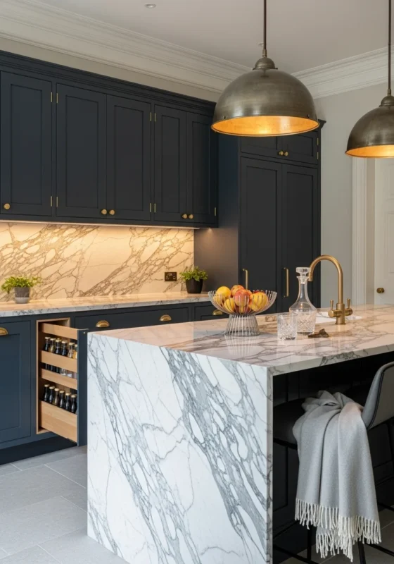
Then the island shifts the focus again. A Calacatta marble island introduces a lighter, more detailed surface.
The natural veining adds movement, which contrasts nicely with the solid navy tone.
This pairing creates a strong visual rhythm. Dark above, light below, with each element holding its own place. It keeps the kitchen from being predictable.
Good lighting highlights the marble’s pattern and keeps the navy from feeling too heavy.
With the right setup, the space is bright, balanced, and full of character.
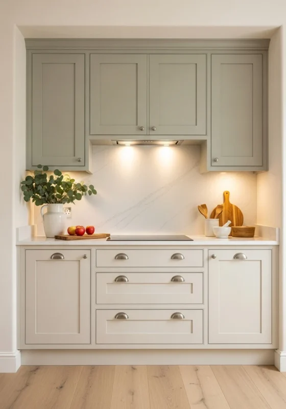
White + Pearl Gray Cabinets
White and pearl gray create a soft contrast that’s calm but still visually interesting, especially in kitchens where you want a lighter look.
The shift between these two tones is subtle to make the space more connected from one side to another.
It also allows other elements like countertops or backsplashes to take on a bit more presence without competing too much.
You can place pearl gray on lower cabinets to gently anchor the room, then use white on upper cabinets to keep the space open, which performs well if the kitchen doesn’t get a lot of natural light.
This pairing also gives you flexibility with finishes and materials.
Brushed metal hardware, soft stone surfaces, or even warm wood accents can all sit comfortably within this palette. In fact, nothing feels out of place because the colors already create a smooth base.
It’s a combination that is easy to live with over time, since it doesn’t rely on bold contrast but still offers enough variation to keep the kitchen from being one-dimensional.
Matte Black + White Cabinets
Matte black and white bring a strong contrast that immediately defines the kitchen, creating a clean and striking look.
Using black on an island can ground the space, giving it weight, while white on the upper cabinets keeps the room from feeling closed in smaller kitchens.
The balance between dark and light becomes the main feature.
Because of that, you don’t need to add much else to make the design complete, since the contrast already draws attention and gives the kitchen a clear identity.
Lighting becomes especially important here, since it helps soften the darker tones. The overall space is bright enough for daily use.
With the right setup, this combination becomes practical, offering a look that stands out while remaining easy to maintain over time.
Olive Green + White Cabinets
Olive green brings a natural tone into the kitchen. When paired with white cabinets, it creates an impressive look.
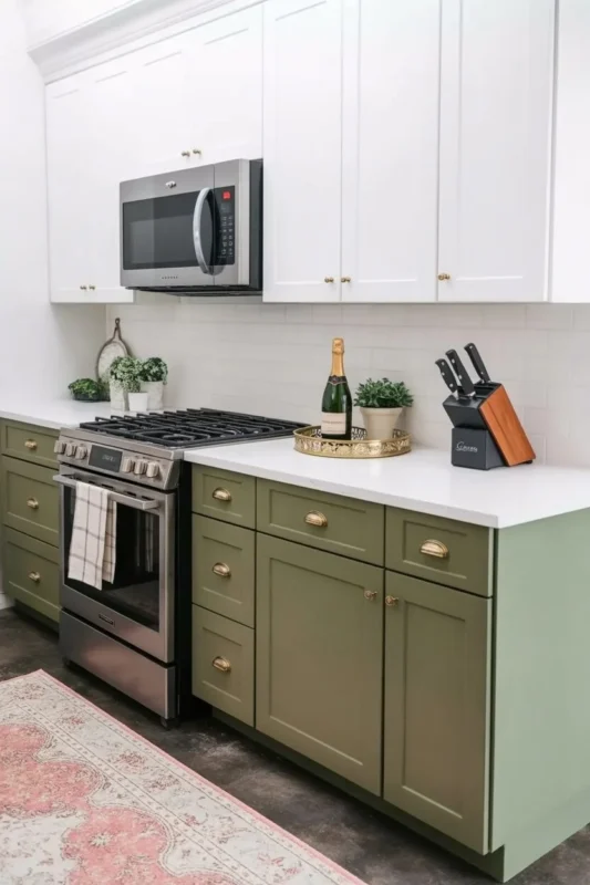
The green adds character, but it stays soft enough to work long term. It doesn’t feel too bold.
White cabinets help keep the space open. They reflect light and balance the deeper tone of the olive, especially when the green is used on lower cabinets or an island.
This combination works well with natural materials. Wood, stone, and simple metal finishes all fit easily into the design.
Sage Green Upper + Cream Lacquer Base
Sage green on upper cabinets adds a soft layer of color that draws the eye upward. It brings interest.
The cream lacquer base brightens the lower half of the kitchen. It reflects light and keeps the room open.
Together, the tones create a smooth transition. There’s no harsh contrast, so the space is easy to move through. This works well if you prefer a softer look.
The lacquer finish adds a slight sheen. It gives the base cabinets a clean surface that’s easy to maintain.
At the same time, it adds a bit of depth to the design.
Royal Blue + Blush Cabinets
Royal blue and blush create a bold and expressive kitchen design. The contrast adds personality to the space.
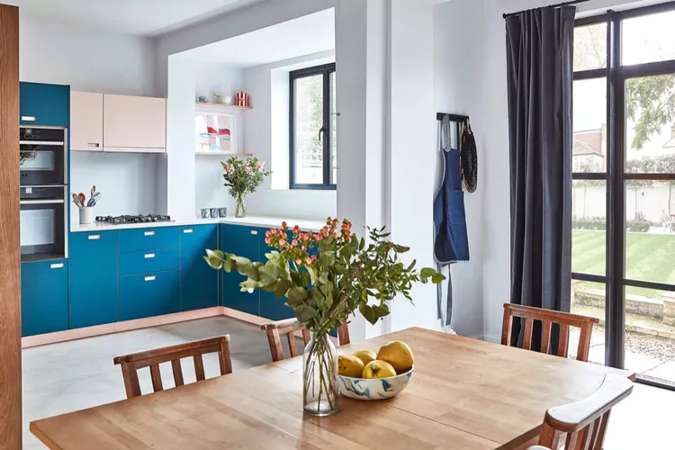
Royal blue brings depth, especially on lower cabinets or an island. It anchors the room and gives it a strong base.
Blush softens the overall look. It adds a lighter tone that keeps the space light. The mix of strong and soft colors creates a balanced effect.
Keeping the colors in separate areas helps the design stay clean. This makes each tone stand out and prevents the space from looking cluttered.
With the right details, this pairing is unique. It’s a great option if you want something different from the usual neutral kitchen.
Graphite Upper + Warm Maple Lower
Graphite upper cabinets bring a darker tone into the kitchen, but placing them higher keeps the space from closing in. The color draws the eye upward and adds contrast in a controlled way.
Below, warm maple changes the mood completely. Its natural grain adds texture and breaks up the darker shade above to keep the design from looking flat/
This pairing works best when the transition between the two is clear. You don’t need extra colors competing for attention.
Let the upper and lower cabinets carry the design, then keep the rest of the elements simple.
Hardware can help tie things together. Brushed metal or matte finishes connect the tones without adding distraction.
Even small details like handles or fixtures play a role in keeping the design consistent.
The result is a kitchen that has contrast but still looks balanced, with each material holding its place.
Mint Green + Honey Wood
Mint green brings a light tone into the kitchen. It stands out, but it stays soft enough to work across different styles.
Pairing it with honey wood adds warmth right away. The golden tones in the wood balance the cooler green to keep the space from leaning too far in one direction.
This mix works well across cabinets and open elements.
You might use mint on upper cabinets and bring in honey wood through lower cabinets. That spread keeps the colors connected across the room.
The contrast isn’t sharp, but it’s clear. Each tone supports the other, which helps the space look put together. It also gives you flexibility when choosing finishes.
This combination suits a kitchen that aims for color.
Blush Pink + White Cabinets
Blush pink introduces a soft layer of color into the kitchen. It adds character.
White cabinets help keep everything bright and clean. They create a base that allows the blush tone to shine in a controlled way.
Placement can shape the overall look. Blush works well on lower cabinets or a feature section, while white can cover the rest.
This keeps the color from spreading too far and helps the design stay focused.
Simple finishes matter a lot. Light countertops, minimal hardware, and clean lines support the color pairing. They keep attention on the cabinets.
This setup offers a gentle shift from all-white kitchens. It brings in color in a way that still feels easy to live with day to day.