15+ Stylish Bathroom Tiles Combinations For A Fresh Look

Picking two or three tiles for you small bathroom sounds simple until you see how quickly colors and patterns can compete.
After working with different tile combinations, I pay close attention to how each surface behaves under the room’s lighting.
A patterned floor may need a quieter wall, while a bold shower tile can handle a little texture elsewhere.
The trick is giving each tile a purpose instead of letting every surface fight for attention.
From marble and mosaic pairings to classic color combinations, the following bathroom tile combo ideas can spark your next remodel.
RELATED: 13 Elegant Blue Tile Bathroom Ideas That WOW
Bathroom Tile Combinations
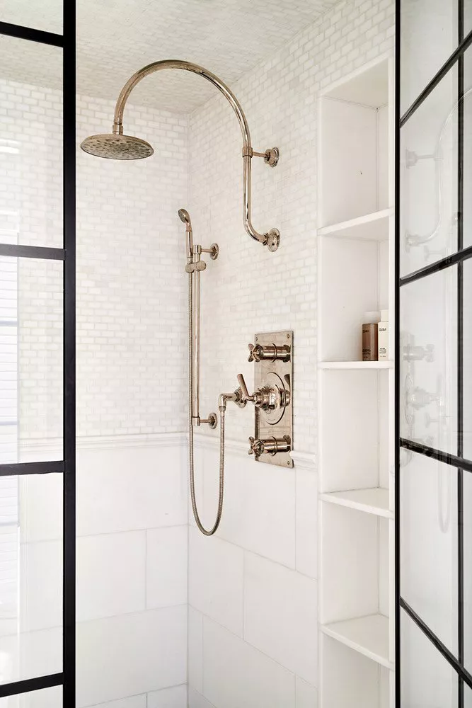
1. Classic Subway Metro Tiles with Black Accents

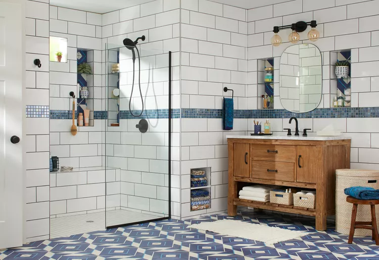
Classic subway metro tiles are one of those bathroom choices that have stayed around for good reason.
Their simple rectangular shape gives you plenty of freedom to bring in stronger details elsewhere.
White subway tile paired with black accents is a reliable combination for bathrooms that need definition.
Black window frames, shower hardware, vanity handles, or a slim border can sharpen the room without covering the walls in dark tile.
The grout choice can shift the appearance too. White grout keeps the subway pattern quiet, while dark grout outlines every rectangle and gives the wall a stronger graphic quality.
For a traditional bathroom, try a pedestal sink or furniture-style vanity with chrome fixtures.
A contemporary room can take the same tile combination toward matte black hardware and a streamlined vanity.
What makes it work: The subway tile supplies a familiar foundation, while small black details introduce contrast in controlled doses.
2. Green & Black Colored Tiles
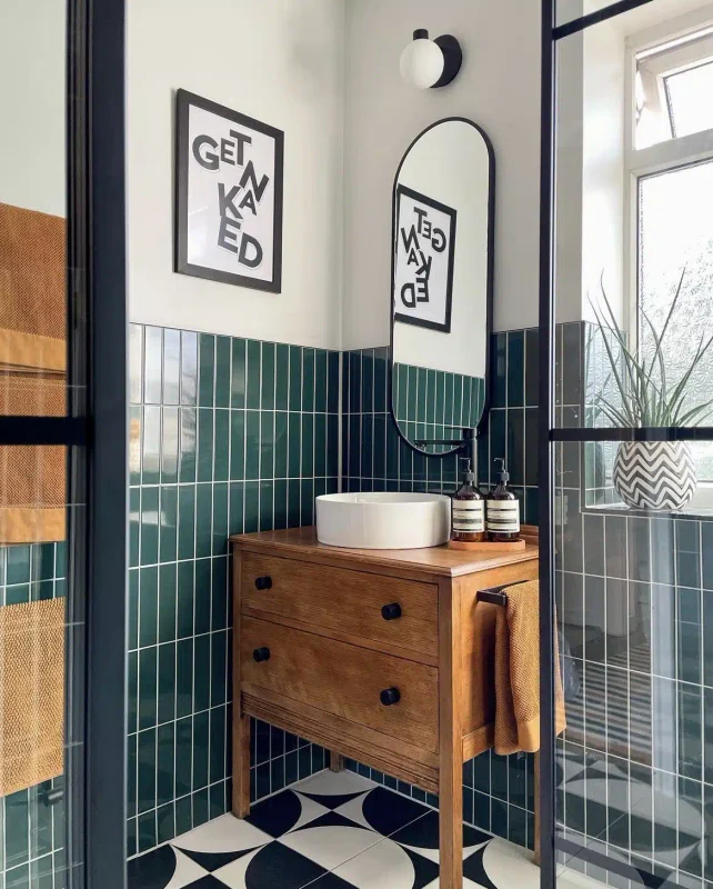
Green and black tiles can take a bathroom into a richer color direction when the green has some depth to it.
Talk of forest, olive, moss, or deep emerald instead of bright primary green.
I personally would use the two colors according to their visual weight. Green can cover the shower walls while black works better as a floor tile.
Lighting becomes important with darker green shades. A bathroom with limited daylight may benefit from lighter green tile.
Brass fixtures can warm up the combination, while chrome keeps the palette cooler. White towels and simple ceramics also give the eye a break from the darker surfaces.
What makes it work: Green carries the color story and black supplies structure, giving the bathroom contrast that does not depend on complicated patterns.
3. Wood Plank and Marble

Wood-look plank tile and marble make an interesting pair because they represent two very different materials.
One mimics the long grain of timber, while the other introduces veining and stone-like variation.
A bathroom floor covered in wood-look plank tile can give marble shower walls a warmer setting.
Porcelain planks are practical here because they reproduce the appearance of wood while handling bathroom moisture.
Keep the marble pattern in mind before selecting the plank direction.
Long floorboards can emphasize the length of a narrow bathroom, while marble veining can draw attention toward the shower or vanity wall.
Warm oak tones pair nicely with white or creamy marble. For a cooler room, gray wood-look tile can sit comfortably beside marble with silver or charcoal veining.
What makes it work: The long plank lines and flowing marble veins provide two different forms of pattern, giving the bathroom interest through material contrast.
4. Concrete and Pebble
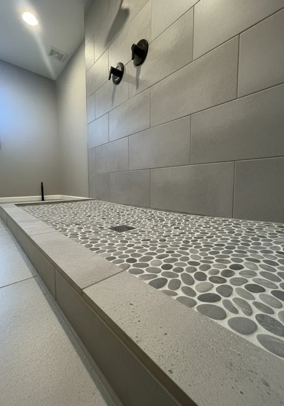
Concrete-look tile with pebble tile brings an earthy, spa-inspired quality to a bathroom.
The contrast comes from the surfaces themselves, not from a collection of decorative accessories.
Large concrete-look tiles are a good choice for the main walls or floor when you want a broad, understated backdrop.
Pebble tile can then mark out the shower floor, a recessed niche, or a small accent area.
The tactile difference is noticeable underfoot. Rounded pebbles break up the uniform surface of large porcelain tiles and suit bathrooms designed around natural materials.
Stick with neutral grout and simple fixtures so the material combination remains the focus.
Wood cabinetry can warm up the gray tones, while black hardware gives the room a sharper edge.
What makes it work: Smooth concrete-inspired surfaces contrast with rounded stone pieces, giving each material a distinct purpose within the same bathroom.
5. Layer with White & Black
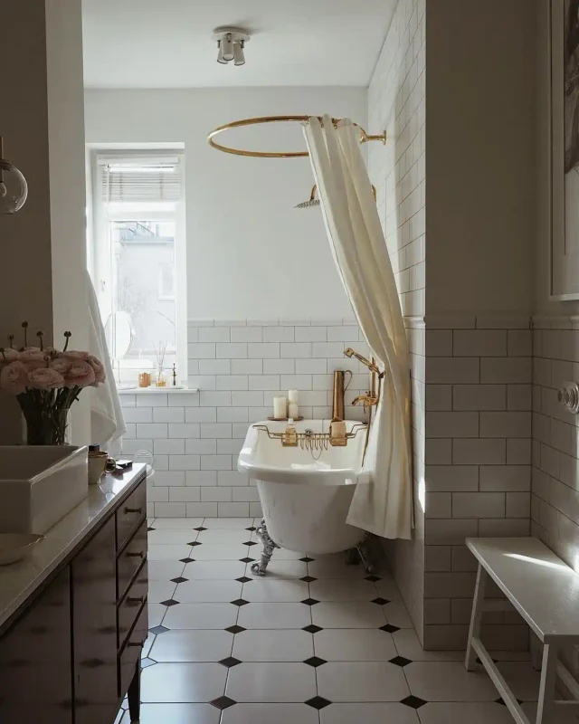
Layering white and black tile gives you plenty of room to play with scale.
A bathroom does not have to use the same tile shape across every surface, and this combination makes that approach easy to pull off.
Try large white wall tiles with small black floor tile, then introduce a narrow black-and-white pattern around the shower or vanity. The difference in scale keeps the two colors from looking flat.
Black can also define architectural features. A dark tiled niche, shower bench, or half-wall can break up a larger field of white tile to give the room a stronger sense of proportion.
I’d keep the fixtures simple when using several tile formats. Too many competing finishes can distract from the clean contrast that makes black and white so effective.
What makes it work: Changing tile scale within the same two-color palette adds variety, so the bathroom gains visual interest through proportion instead of extra colors.
6. Combine Pattern with Classic Wall Panelling
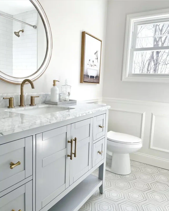
Patterned tile can bring plenty of energy to a bathroom, so pairing it with classic wall paneling is a smart way to give the eye somewhere quieter to land.
I prefer using the patterned tile on the floor and keeping the upper walls restrained.
The paneling brings an architectural detail that tile alone cannot provide.
Painted in a soft white, it gives the room that traditional American bathroom character you see in older homes.
Scale matters here. A busy floor pattern needs enough breathing room around it, mostly in a smaller bathroom where every surface sits close together.
Keep the paneling below the vanity mirror or along the lower half of the walls.
That division gives the patterned tile its own territory and keeps the room from looking overloaded.
What makes it work: The tile supplies the decorative moment, while wall paneling gives the rest of the bathroom a calmer visual rhythm.
7. Zellige and Slate
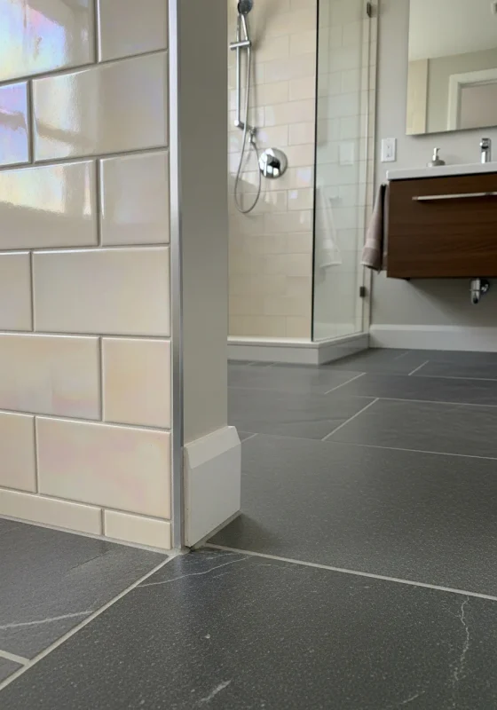
Zellige tile and slate make an interesting pairing because neither material looks overly uniform.
Zellige has those slight glaze variations that catch light across the wall, while slate brings a grounded, stone-like quality underfoot.
This combination suits a bathroom where you want the materials to carry the design.
A soft cream Zellige wall can sit against a charcoal slate floor, giving the room a natural contrast that does not depend on bright colors.
The grout deserves some thought with Zellige. Tight joints can emphasize the handmade appearance, while wider lines make the individual pieces easier to read.
Slate also needs proper sealing and regular care, so I’d treat it as a deliberate material choice instead of simply picking it because the color looks good in a sample.
What makes it work: The two surfaces have different textures and visual qualities, giving the bathroom interest even when the color palette stays restrained.
8. Geometric Floor and Subway Walls

A geometric floor can do plenty of decorating work when the walls are covered in classic subway tile.
That pairing is useful when you want pattern but do not want the entire bathroom competing for attention.
The floor becomes the place where you take a design risk. A simple black-and-white pattern can give a white subway wall some needed contrast in a bathroom with basic fixtures.
Run the subway tile in a traditional horizontal pattern here. Keeping its installation familiar gives the eye a predictable surface above the stronger floor design.
Grout can tie the two areas together. A dark grout line in the wall tile can pick up the darker color from the floor and make the combination look planned from the start.
What makes it work: The patterned floor gets to make the statement, while the subway walls provide a familiar backdrop that keeps the room from becoming visually noisy.
9. Chevron Wall and Small Grid
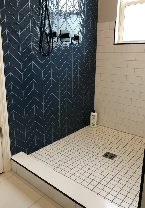
Chevron tile has a directional quality that immediately draws attention to the wall.
Pairing it with a small grid tile on the floor gives the bathroom two different patterns that still have clear boundaries.
Use the chevron behind the vanity where the pattern has enough uninterrupted wall area to read properly.
A smaller floor grid then adds interest underfoot without competing for the same visual territory.
The grout color can change the character of the grid considerably. A close match to the floor tile keeps those lines quiet, which is useful when the chevron has strong movement.
This combination also benefits from a simple vanity. Too many decorative details around the mirror or countertop can make the wall pattern harder to appreciate.
What makes it work: The chevron controls the directional pattern on the wall, while the small grid gives the floor its own detail at a smaller scale.
10. Terrazzo and Solid Tones
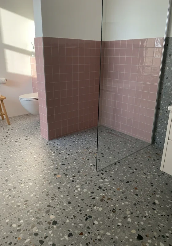
Terrazzo already contains plenty of visual information, so pairing it with solid-colored tile keeps the bathroom from becoming a collection of competing patterns.
A terrazzo floor is a good starting point when you want the room to have some personality underfoot.
Choose one color from the terrazzo chips and carry it onto the shower walls.
That connection makes the two surfaces relate to each other, even though one is heavily patterned and the other is plain.
This approach also makes future decorating easier. Towels, artwork, and small accessories do not have to compete with several different tile patterns.
In my opinion, I would keep the solid wall tile fairly simple in shape. A complicated installation could distract from the little flecks that make terrazzo interesting in the first place.
What makes it work: The solid tile gives the terrazzo somewhere to breathe, letting its scattered pattern remain noticeable instead of turning the bathroom into visual clutter.
11. Fish Scale and Smooth Stone
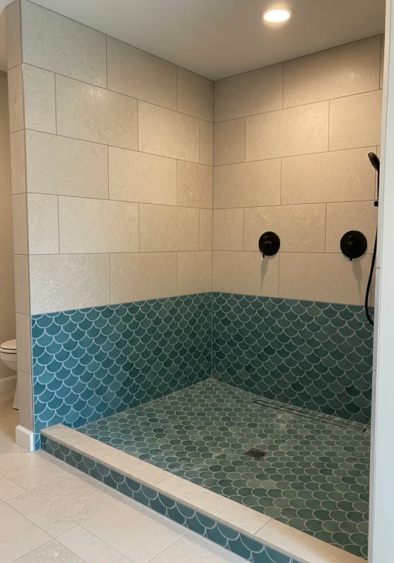
Fish scale tile has a distinct shape that can easily become the star of a bathroom. In a shower I worked on, smooth stone on the floor gave that decorative wall plenty of room to breathe.
The curved edges soften the hard lines you normally see in bathrooms. A pale stone floor also keeps the transition from looking too busy underfoot.
Color changes the whole mood of this combination. Deep blue fish scales bring drama, whereas a muted green version pairs nicely with warmer natural finishes.
One detail worth checking before installation is the grout. Keeping it close to the tile color preserves the flowing appearance of the scales instead of outlining every piece.
What makes it work: The curved wall pattern and understated stone floor perform different jobs, so neither surface has to compete for attention.
12. Checkerboard with Subway
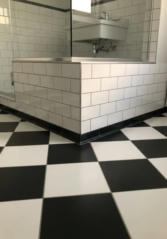
Checkerboard floors have a way of making a bathroom look established, even in a brand-new renovation.
A few years ago, a black-and-white floor paired with white subway walls gave one small bathroom I worked on that classic look the homeowner wanted.
The wall tile stayed deliberately simple. That decision mattered because the checkerboard already carried plenty of contrast across the floor.
Tile size can change the personality of the room, too. Larger squares look cleaner and stronger, while smaller squares push the design toward an older, more traditional bathroom.
For the subway installation, matching grout keeps the rectangular pattern from becoming too prominent. That leaves the checkerboard as the main visual detail.
What makes it work: The floor brings the graphic punch, while the subway walls provide a familiar surface that keeps the combination from becoming overwhelming.
13. Diamond Floor and Picket Wall

A diamond floor naturally pulls the eye across the room, so the wall tile needs a different kind of rhythm.
Picket tile has proved useful for that job because its narrow shape introduces detail in a completely different direction.
During a vanity renovation, this pairing gave the room plenty of geometry while keeping the color palette simple.
The floor had the stronger presence, and the picket wall quietly continued the pattern story above it.
Neutral shades make this combination easier to manage. White walls with a charcoal floor show the shapes clearly without adding another layer of competition.
Installation deserves careful planning around corners and plumbing. A small misalignment becomes noticeable when geometric tiles meet at a busy junction.
What makes it work: The floor and wall use contrasting shapes, so the bathroom gains variety through geometry instead of relying on several colors.
14. Marble & Terracotta
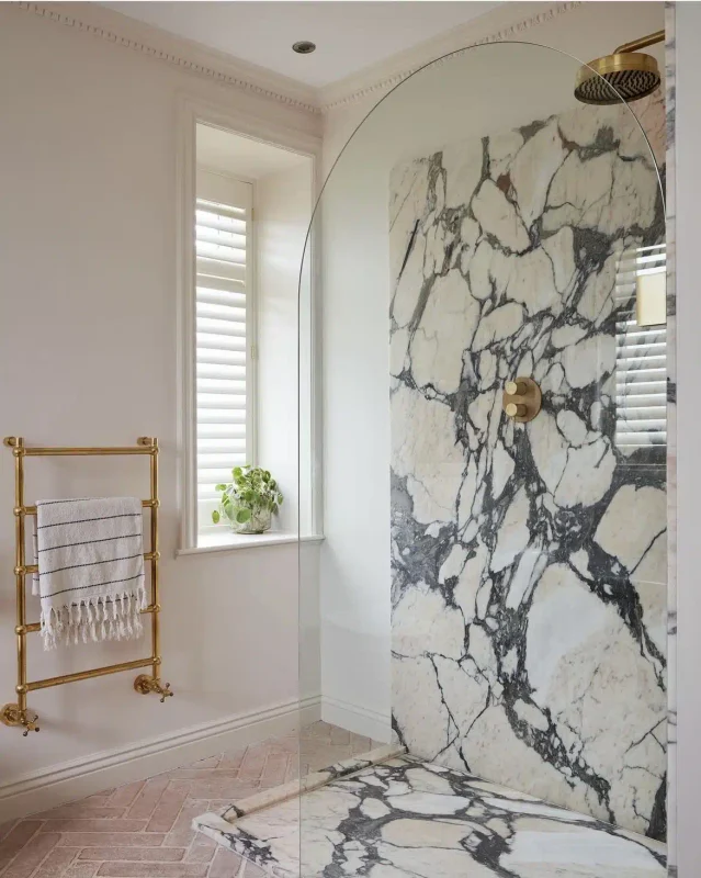
Marble can sometimes leave a bathroom looking too cool, particularly when nearly every surface is white or gray.
Terracotta changes that equation quickly by introducing an earthy color underfoot.
On a recent project, the terracotta floor gave pale marble walls a warmer companion.
The combination also made the white vanity look less stark against the surrounding finishes.
The marble does not need dramatic veining here. A quieter stone keeps the terracotta from having to compete with another strong pattern.
Keeping the terracotta on the floor also makes the color easier to live with. It becomes part of the foundation of the room instead of taking over every wall.
What makes it work: Warm terracotta offsets marble’s cooler qualities, giving the bathroom contrast through color temperature and material character.
15. Cool Tones With Blue & Grey
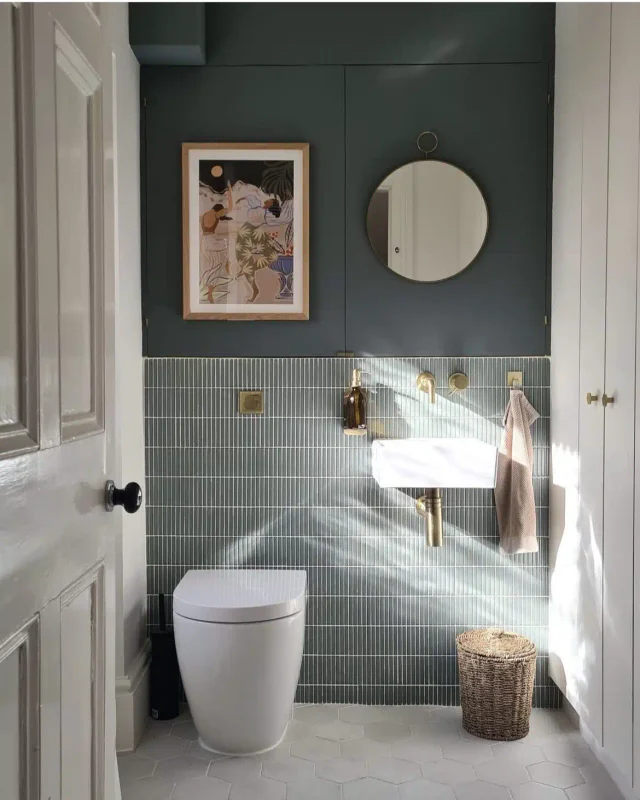
Blue and gray look simple on a tile board, but their undertones become obvious once they meet inside a real bathroom.
A blue with a green undertone can sit awkwardly beside a gray that leans purple.
I ran into this during a bathroom renovation with plenty of daylight.
A dusty blue sample ended up being the better match for the medium-gray floor because the two colors shared a similar softness.
Warm white walls helped keep the palette from becoming too icy.
Natural wood on the vanity added another temperature shift, but the tile remained the main color story.
Testing samples at different times of day is worth the effort here. Morning light can make a tile look very different from the same piece under evening fixtures.
What makes it work: The blue and gray belong to the same cool family, but carefully chosen undertones keep the combination from looking flat or mismatched.
16. Stacked Square and Hexagon
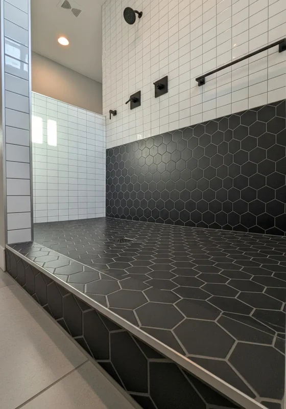
Straight stacked squares have a crisp, orderly appearance, while hexagons bring a little irregularity to the floor.
That contrast came in handy on a bathroom project where the walls needed to stay simple.
The square tile was installed in a clean vertical stack behind the vanity. Hexagon tile on the floor then introduced another shape, giving the lower half of the room its own detail.
Keeping the colors close made the geometry easier to appreciate. A white-on-white combination can be surprisingly effective when the two surfaces have different shapes.
Grout plays a big role with hexagons. A close match makes the floor pattern quieter, while darker grout draws attention to every individual piece.
What makes it work: The two tile shapes create enough contrast to keep the bathroom interesting, while a restrained color palette prevents the geometry from becoming too loud.
Final Thoughts
Bathroom tile combinations can change the entire character of a space, even when you stick with simple materials.
Mixing patterns, shapes, colors, and finishes gives each surface a clear purpose.
From classic subway tile with bold flooring to marble paired with terracotta, the right combination comes down to how the pieces relate across the room.